Friday, 31 March 2017

OUGD603 - Unpackaged Research Brief - Market Research

After looking at the current unpackaged stores such as Lunzers in Vienna, Effecorta in Italy and Unpackaged in the UK I decided to look further into logo design and name ideas for my own proposed store. 

I created a mind map of names that I could think related to the ethos of the store, things that suggest what the store does within the name. Some of them are a bit too obvious in my opinion and just wouldn't work like 'Loose' - it implies lack of control. However I quite like the names Clear, Zero and Terra. The use of a simple word to name the store seems apt as it is promoting a simple way of life. 


So I took the three names forward (Clear, Zero & Terra) and decided that I will narrow them down to one name after further development and research. 


I began looking at logos for some inspiration. One thing that struck me was that all of the brand identities of the current anti-packaging stores was that they were all very minimal. Perhaps as a nod towards the zero waste lifestyles they wish to lead. Only Unpackaged's logo has a visual hint towards what they do. I decided the best way forward would be to research into similar sustainable venture's logo designs and try to piece together an image for the brand.

I really loved the hand-drawn naivety of this logo design. Olive sells botanical, natural cosmetics and have reflected nature in their branding. The hand drawn type makes the brand approachable and feel organic and natural. The logo illustration again reflects this through the use of leaves. The illustration reminds me of a greenhouse, bringing thoughts of lush green plants. The whole logo builds up to an image that is very natural and organic perfectly reflecting their products. 


This identity on the other hand has no organic hand drawn lines in it whatsoever. They have gone for a more minimal and clean illustration style. Roots and Bulbs is a smoothie maker so perhaps this clean style is to represent the clean eating smoothies that they sell. Also I feel like this style reflects the brand better as the sans serif type is more stable and trustworthy than a hand drawn type for example. It gives you faith in their products. The colour palette used here reflects nature also, using tones of green again connotes green fields and fresh vegetables. 


Also the use of contrasting rustic materials on the menu and in store again adds to the natural vibe that they are trying to get across. 

OUGD603 - Print Fest Jessy Lanza - Finals & Evaluation


I’m really happy with how the final result came out. I was worried from the positives that it might be a bit boring but I think the experimental method of printing really helped to make the design more vibrant. I think that this style of experimental printing also lends itself well as a visual interpretation for Jessy Lanza’s music. Her music is a bit edgy and different, just like how my print turned out.

I think my interpretation of the song is unique as well, taking the vibrancy of city life and contrasting it against the calm of nature. Overall, I think that this print was really successful and I learnt a lot from experimenting with the inks like this. I think that it works much better than flat colours.


Strengths & What I liked

I really enjoyed the traditional print process of this brief, I spent a whole day in the print room just experimenting with the colours and marbling with the inks. This has shown in my final print, I think that it really stands out because of the print processes.


Weaknesses & What I didn’t like

I could have spent more time refining my ideas so that my final design would be more polished. However I think that it still turned out well. There was not a part of this brief that I didn’t like doing.


Time Management

I managed my time really well considering I had a lot of other briefs deadlines on the same week as this. Though my rush to finish the print meant that I printed it on cartridge paper rather than the GF Smith stock due to it not turning up on time.


Final Outcome

I’m really happy with how the final result came out considering my limited time scale for it. Visiting the exhibition and seeing it with the other prints was really inspiring.

Thursday, 30 March 2017

OUGD603 - Unpackaged Brief - Kamikatsu, Japan, The Zero Waste town


Kamikatsu in Japan used to incinerate all of their waste until 2003 when they decided to start the zero waste program. Since then 80% of their waste is reused, recycled or composted. They have 34 different sections to separate their rubbish into including different types of plastics, metals and papers. Though it does some time consuming and difficult, the impact on the environment is incredible. They also have a store within the town where they can take unwanted clothes or furniture and swap it with other people's unwanted things. They also reuse old clothes to make new things like teddy bears from old kimonos. I think this has really worked for Kamikatsu because they are a small town. If this was to take effect in a big city then a lot more people would oppose the idea and not follow the strict rules. 

On the same Youtube channel I came across another video of a woman who tried to produce zero waste over a year.


Rachel studied environmental sciences and decided one day, looking at all of her food wrapped in plastic containers and bags in her fridge that something needed to change. Any rubbish she can't figure out what to do with she puts in a jar. She started composting her food waste and buying in bulk to eliminate 80% of her waste. Like with my zero waste store, she uses all of her own containers to buy her foods, from using a jar to fill her oil to finding a brewery that would fill reusable glass bottles with beer for her. Although it seems that she has cut a lot of things out of her life that would produce waste, for example, she makes her own toothpaste to save buying it in non-recyclable tubes. She also makes sure all of her makeup comes in recyclable packaging. 

Wednesday, 29 March 2017

OUGD603 - Starpack Collab - Tin Designs


For the tins we wanted something that could be used after you had finished with the bottle. Also we knew from the brief that we had to make it out of tinplate so it would be durable enough for re-use. Our first idea was to use a normal metal tin and engrave the illustrations into the bare metal. The logo and flavour would then be embossed out of the metal tin. Though this idea would work well we felt that the tins themselves were too ordinary and simple. It didn’t suit the sophistication of the brand that we wanted to get across.


We decided to come up with our own unique shape for the tin so that it would really stand out on the shelf. We played with having a slanted lid, so that when you open the tin you can see the bottle peaking out. Also having more of the accent colour on the lid really makes a striking tin design. The addition of the illustrations on the bare aluminium creates an elegant yet contemporary looking tin that is unique to our design. We also brought across the filtered sticker to seal the tin and tie it together with the premium nature of our vodka. Keeping the information to the back of the tin means that we could make the front of the tin, that would be shown on the shelf as visually striking as possible.

OUGD602 - PPP - Business Card Development


I recreated the design that I had made using paper on illustrator, changing the colour to the colour I have used on my updated website. Having another look at the design I felt like it may be too playful and not professional enough. Though I like the use of the scattered type I got some feedback that it might be too much. Another piece of feedback I got was about my old monogram logo, and why I didn't use that. 


So I tried it again with my monogram logo instead of my full name and I think that it works as a really nice contrast. It seems this logo will stick with me for another year or so! The only thing is I may alter the shapes slightly to fill out the empty space, however, I really like the framing effect that it has created. 


I tried out closing the gaps a bit with more shapes but looking at it I feel like it's a little too busy. I liked the design before where it gave my logo a bit of room to breath. This just feels cluttered and a bit clumsy. 


I copied the pattern over to the back of the business card and put my new information in, with my new domain name and email address. I really like how the design is mirrored on both the back and front making a really cohesive design. 
To print the cards I'm going to have them professionally printed at moo.com. I ordered a sample pack to give a feel for which ones I would want to receive. I was tempted to have a go at spot UV varnishing my logo or the patterns but I eventually decided on their "luxe" business cards. The tactile quality to them makes them seem more sturdy than the others, at 600gsm they were the thickest. 


The other thing that attracted me to the Luxe cards was the coloured strip in the middle. I have always wanted a duplexed business card using coloured stocks so it seemed like the right time to do it. I chose orange to compliment the orange-red that I have used within my design. 

Tuesday, 28 March 2017

OUGD603 - Starpack Collab - Feedback

We created some feedback forms to make sure that our designs were going in the right direction and that they were suited to our target audience. Showing a picture of our bottle designs so far we asked 4 questions about our target audience and where they thought that it would be sold.


I also posted on my facebook page in order to get a wider range of people to answer, not just design students.

Overall I think that this was a really helpful experience. It allowed us to confirm that we were going in the right direction as well as getting a variety of feedback in a short amount of time. Most of the people who answered provided the information that we wanted to hear - with the right target audience and the right area for sale. 

OUGD602 - PPP - Personal Branding


After looking at my personal branding from last year it left me feeling a bit cold. I was trying to create a contemporary look for myself but as I've found myself more as a designer this year I realised this isn't me at all. Though I do still appreciate the screenprinted craft I feel that the design itself is too minimal and doesn't represent me as a designer.

So I decided to have a play with my name and the shapes that are made from it. I found some coloured paper in the studio and decided the best hands on way to play around with layout was to do some cut outs of the shapes and letters.


I started out in a business card size with something quite simple, just my name and triangles taken from the shape of my last initial W. I felt that having this sort of whimsical layout was a playful way to show my personality through design. It kind of shows that I'm not perfect which I believe a minimal layout would leave people to think. 


Next I played with my initials instead, it leaves a lot of white space but has the same sort of feel as before. I think that it looks better than just my name, but I feel it is lacking something. Perhaps it is the shapes that I have been using that don't seem to fit.


Next I tried some different shapes, zig zag lines that again represent my last initial W but more stretched. I really like the use of the lines to frame the card, giving it some purpose somehow. It feels more playful than with the triangles, however something was still lacking. 


So I moved onto a bigger piece of paper and tried out combining both of the shapes that I had cut out. This created a composition that I felt really exuded playfulness. The combination of the triangles and zig zag lines creates a sense of movement rather than it being a static, boring design. 


I also tried this type of composition with my full name to see if it worked and I think that it does. The scattered type effect would lend itself really well to a gif, so maybe this is something that I could explore for contacting people. I'm going to try this ideas out digitally and change the colours around because I'm not too sure whether I like the colour palette of blue and yellow. 

Monday, 27 March 2017

OUGD603 - Unpackaged Research Brief - Bags

While researching for this brief I wondered if brown paper bags were sustainable enough to produce some for the theoretical anti-packaging store. Although according to the waste hierarchy you shouldn't use anything unnecessary (a tote bag could be reused whereas paper bags may not be able to be reused) I was curious to see how bad they could really be for the environment.

I found an article in The Guardian (https://www.theguardian.com/environment/shortcuts/2011/dec/20/paper-plastic-bags-which-best) comparing plastic bags to brown paper bags. Through reading this article I also found out about Wrap, the government-funded company set up to reduce waste. They basically said that any type of bag has an environmental impact:

"All types of carrier bag, whether made from plastic, paper or jute, will have some impact on the environment during the manufacturing process, transportation and ultimate disposal. The best way to reduce their carbon footprint is to simply re-use them as many times as possible and then recycle them at the end of their useful life."

So basically, the more reusable a bag is the better that it will be for the environment. The article goes on to quote more sources on the subject:

"Faced with the question of paper or plastic, the answer should always be neither," says Reuseit.com. According to a 2007 study (funded by US plastic bag manufacturers), it takes almost four times as much energy to manufacture a paper bag as a plastic bag. Paper-bag manufacture uses 20 times as much water as plastic and paper requires more energy to be recycled.
So maybe paper bags are not an option for the un-packaged shop that I plan to create. It seems that customers will be better off bringing all of their own receptacles to store the goods they want to buy rather than the store providing any when it comes to bags. In fact, the article goes on to say that cloth bags would have to be re-used 131 times to reduce its environmental impact of that of a single-use plastic bag. It really seems like we can't win when it comes to packaging.

OUGD603 - Up Yer Sleeve - The Brief

A peer of mine Cameron wanted to set up an exhibition of record sleeves as a replacement for there being no Secret 7" this year. He focused on artists that we had lost within the last decade to commemorate them through art. He allocated everyone a song to create a visual interpretation for it. 


My song was Moody's Mood for Love by Amy Winehouse. I was really happy with this allocation because I really appreciate Winehouse's music. However, she never made a music video for this song so I am going to have to create an interpretation for this based on lyrics and the sound of the song alone. 


I found that looking into her other album covers that Amy usually sits centre stage, in fact I couldn't find an album cover  that she didn't appear on. Taking this as inspiration I decided that I wanted my cover to be a portrait of her. It would act as a respectful commemoration as well as following the theme of her previous album designs.  


Saturday, 25 March 2017

OUGD603 - YCN GUCC - Evaluation

Strengths & What I liked

I think that the concept for the packaging we produced was really strong, creating something with a strong meaning behind it. The use of stickers and customisation really set our final resolution a part from other entries who most likely followed the brief to a tee.


Weaknesses & What I didn’t like

I don’t really enjoy creating web design, and sometimes I think this is one of my weakest areas of design so having to create a full customisation process on the website was not an enjoyable process for me. Also I struggled with the illustrator towards the end of the project, she put other briefs and personal work before getting this brief finished which annoyed me slightly.


Team Work

Collaborating with an illustrator was really beneficial to creating designs that I wouldn’t ordinarily create. It has also given me relevant experience for industry, as in a studio they will most likely hire an illustrator for all their illustrations. I also learnt about the importance of good communication, as I struggled doing design work when my partner wasn’t getting back to me, which halted the design process a bit. Also the fact that she lost illustrations she said she was going to provide and didn’t provide me with an alternative put a bit of a dampener on the whole experience.


Time Management

Though we spent a long time on this project the design process was very stinted in regards to timing because there would be large gaps while I would wait for a response from my team mate. However we managed to get everything finished and submitted just before the deadline so in that aspect we did okay.


Final Outcome

As a set I think that the packaging all works really well together, having a similar aesthetic combining graphic text with hand drawn elements. We have offered the brief a new outlook by allowing customers to customise pretty much all of the outer packaging, really promoting people to create a personal message that someone would be happy to receive.


OUGD602 - PPP - Portfolio Website

After building up my portfolio a bit more I decided to make a portfolio website. I found out that Adobe do portfolio sites as part of the Creative Cloud subscription so I went ahead and made one through this. I found it really easy to create the layout that I wanted and I think that it already looks miles better than my previous site.


The landing page shows my projects, which you can click through for the full project and information as you can see below. 


I also included the same about me section that I had on my previous website but with a more up to date picture, in keeping with the colour scheme.


I've also included a copy of my up to date CV on there in the hope that people may contact me through the site for job opportunities. 


I've also got myself a custom domain name so that I can look more professional rather than having the ".myportfolio" tag. Also I have a custom email along with the domain name which is hello@hattiedesign.co.uk which again will look more professional than just a gmail email address. You can see the website live here: hattiedesign.co.uk


Thursday, 23 March 2017

OUGD603 - Unpackaged Research Brief - Research into the Topic

On the Unpackaged website they go into a lot of depth about why they have chosen to use no packaging. A lot of this information is really helpful and they have done it in a very concise way.

WHY PACKAGING?
It’s hard to visit a landfill site without being struck by the craziness of taking very valuable minerals and resources out of the ground, using a lot of energy, turning them into short life products and then just dumping them back into the ground. It’s an absolutely monumental waste of energy and resources. As someone from the fashion industry might say, it’s just so last century. (Michael Pawlyn, The Guardian, November 21 2005)


Whilst some packaging is necessary in our modern industrialised food chain, unnecessary packaging is a waste:
Cost: It increases the price of the goods you buy. You are charged twice – first when you buy overpackaged products and then through your council tax for disposing of your rubbish & recycling.
Waste: It wastes resources at every level: production, storage, transport and disposal.
Pollution: Landfill and incineration are the two main ways of dealing with un-recyclable packaging waste. These are major pollutants for people, and the environment, as they leach toxins and release greenhouse gases. The unpalatable truth is that we’re running out of landfill space – we will reach a time that the landfill holes in the ground are full with little mainstream impetus to find alternatives.

What about recycling? While some packaging is recycled, most ends up in landfill sites and some is too complex to recycle as the facilities don’t exist, or aren’t cost effective. Recycling is part of the solution, but only if we use it as a stepping stone to a zero waste circular economy where we use less packaging and develop systems based on re-use & refilling.

Follow the principles of the Waste Hierarchy and
Reduce by only buying what you need
Reuse by bringing your containers for a refill
Recycle what you can’t reuse
And… if you can’t reuse or recycle it then don’t buy it!

After reading through this, a lot of it was what I discussed within my dissertation, to do with the waste and pollution. I also like how they have translated this information into how it benefits the consumer as well as the planet. However, the Waste Hierachy is something that I have never heard of before. So I looked a bit more into what it is. 

WASTE HIERACHY

The evaluation of processes that protect the environment alongside resource and energy consumption to most favourable to least favourable actions. The hierarchy establishes preferred program priorities based on sustainability. To be sustainable, waste management cannot be solved only with technical end-of-pipe solutions and an integrated approach is necessary.
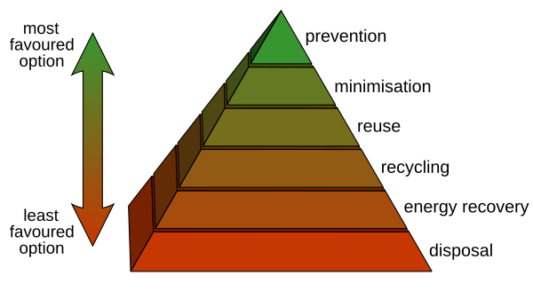
The waste management hierarchy indicates an order of preference for action to reduce and manage waste, and is usually presented diagrammatically in the form of a pyramid. The hierarchy captures the progression of a material or product through successive stages of waste management, and represents the latter part of the life-cycle for each product.
The aim of the waste hierarchy is to extract the maximum practical benefits from products and to generate the minimum amount of waste. The proper application of the waste hierarchy can have several benefits. It can help prevent emissions of greenhouse gases, reduces pollutants, save energy, conserves resources, create jobs and stimulate the development of green technologies.

Here is an example of a waste hierachy pyramid, with the most favoured options for the environment being at the top and the least favoured options being at the bottom. 

I also found some more compelling facts about packaging and recycling in the UK (by Unpackaged again):


In general, I think the Unpackaged store in Hackney is a perfect role model of sorts to other prospective stores.


OUGD603 - YCN GUCC - Final Presentation Boards & Submission


We created six pre-made templates in total, ready to customise for each occasion. The customers can add their own photos to frames, add or remove stickers on the wrappers and the box sleeves in order to create a truly unique design for them.

Unfortunately we couldn’t print on a textured stock as we had originally planned so we ended up adding on the texture digitally to add that organic feel that we were looking for. However, the print itself has turned out really well, providing really vibrant colours.

As a set I think that the packaging all works really well together, having a similar aesthetic combining graphic text with hand drawn elements. We have offered the brief a new outlook by allowing customers to customise pretty much all of the outer packaging, really promoting people to create a personal message that someone would be happy to receive.

Collaborating with an illustrator was really beneficial to creating designs that I wouldn’t ordinarily create. It has also given me relevant experience for industry, as in a studio they will most likely hire an illustrator for all their illustrations. I also learnt about the importance of good communication, as I struggled doing design work when my partner wasn’t getting back to me, which halted the design process a bit.


The landing page shows a coherent guide of the process before it starts, then takes the customer through the customising process logically. Within the process the user will have the option to add a “handwritten” note to the back of the sleeve design, to again maintain the personal element of our postal concept.

I think that the final website is easy to navigate through the customisation process. I tried to think of all the elements you would need in the customisation process, as well as maintaining the brands friendly tone of voice through tips at the bottom. The use of the simple stripped back layout and colour scheme makes it easier to focus on the design that you are customising rather than being distracted by anything else.

I created 12 web pages in total to show the customisation process all the way through, from picking the chocolate flavours to placing stickers onto their chosen template.