Showing posts with label CoP. Show all posts
Wednesday, 11 January 2017
Monday, 9 January 2017
OUGD601 - CoP - Evaluation
In this module I feel like I have learnt a lot. Not only about my chosen subject matter but also about how important time management can be. I found that reading and researching well in advance really helped me with being organised within this module as it meant I could spend more time writing as I had completed some of the research already. In the written part of this dissertation I felt that I have greatly improved my writing and analytical skills which I will try to take through to use in other modules writing on my blog and design boards. However I did often struggle with getting thoughts down on paper and as a result I believe my essay is shorter than it should be. Although I feel that it does successfully answer my question.
For the practical side of this module I feel I could have given myself a bit more time. Though I do feel that I managed my time well through out I wish I could have achieved more. The resulting designs that I created I am quite proud and feel like the concept behind them is excellent. If I were to have more time on the project I would develop the brand of sprout further, perhaps creating a full campaign to raise awareness rather than just an info-graphic. Also if I had more time on this project I could have experimented more with different more innovative materials, where as I just chose an easy solution.
Also I think that the synthesis between the written essay and practical project merges together really well because it fulfils Coles (2003) definition of packaging as well as agreeing with other writers such as Papanek (1971, 1995) and Klein’s (2015) ideals of changing the consumers views and life style first rather than trying to tackle the big corporations head on. Though my proposed design solution is not perfect I believe it is a good start.
Overall, I am really proud of both outcomes of this module and hope that it provides a basis of my work to follow throughout the rest of this year. I would like to use my newfound passion for sustainability through as a thought for all my other designs.
Thursday, 5 January 2017
OUGD601 - CoP Practical - Final Website and Motion graphic
Final Website
To back the packaging I wanted to create a small online presence in order to further spread awareness. I decided to keep it online as print collateral would cause unnecessary waste and most likely end up in the rubbish too. The website itself is kept minimal to portray a no-nonsense message and to be as clear as possible for all audiences. This is only a small snapshot of sorts of the whole website. If I had more time working on my practical I would have created more pages.
Infographic
Sprout Infographic from Hattie Windley on Vimeo.
Additionally, I created a short infographic motion graphic animation as seen above. Considering this is my second time fully using after effects I am pleased with the results. The infographic explains the packaging concept as well as a few statistics that I found from my essay. Once again, like the website a simple and pared back approach has been used in order to portray the message as simply as possible. I didn't have much time to develop this motion graphic any further although I am still happy with the outcome.
Monday, 12 December 2016
OUGD601 - CoP Practical - Sprout Final Packaging
The final sprout packaging printed out really successfully. I was concerned that the seeds in the paper would disrupt the ink but it worked out fine. I feel like the design looks really professional, and I could see it popping out on the super market shelves. I feel like the final packages work well as a trio together, with the colours complimenting each other. The aesthetic that the seeded paper produces is really rustic and tactile, making you want to feel the paper. This will certainly add to the novelty of this packaging and I would hope that this would attract people to pick it up who might not ordinarily be interested in this type of product. Although this provides some sort of future for the food packaging industry, thought still needs to be made into how we use, and sometimes abuse, packaging. But as Papanek rightly pointed out sometimes the packaging is indeed the product so I don't believe that there can be a future completely without food packaging.
OUGD601 - CoP Practical - Sprout brand development
After completing the packaging part of the project I decided to create a little bit of an online presence for the company sprout. It makes sense to do it digitally because a print campaign would be unsustainable. So looking at innocent smoothies I tried designing a really visual website.
The result, I feel, is very uninspiring and static. I tried to liven it up with a patterned background but I think it is the use of the photos in such a rigid structure. I want the website to feel playful and fun to entice its target market and as it stands this design portrays neither.
Looking at one of the websites I found during the anti-packaging movement research I was inspired by their fun and active layout. The logo and navigation bar stay static but the rest scrolls. They also include fun illustrations that makes the site seem more personal. I will try a similar layout with my website design.
I wanted to keep the green colour scheme because of its connotations of being environmentally friendly so instead I used tones of green as well as duotoned images to add more depth and interest to the site.
The home page is kept quite simple and minimal with the main products front and centre. Like the Lunzer site I decided to go with a static logo and navigation bar at the side and keep the rest movable.
As you scroll down more content is revealed in little post it note-esque columns. Splitting the information up like this allows users to view lots of information at once rather than having to go find it through the navigation bar. Though you can still go to the individual pages through the navigation bar I think that this way people will find information they aren't necessarily looking for.
I altered the quote on the first page a little after some feedback saying that I should reflect the packaging and use the same font choices.
Next I made a page with the diagram for planting the paper so it is clearer for people to read than small on the back of the packaging. I also decided to add some muted tones to make it pop more. I tried to add a bit of interest with hands pointing rather than arrow heads but I feel like it doesn't really fit with the clean style that is used within the illustrations. I also felt the positioning of the arrows leading to the next stage was a bit clumsy.
So I changed the arrow heads back to a more traditional minimal style as well as organising the layout a bit better to be clearer. Overall I'm really happy with these pages, if I had more time I would produce the whole website however, I would like to produce a short motion graphic/infographic video that could be used on social media to gain traction for the cause and raise the much needed awareness.
Saturday, 10 December 2016
OUGD601 - CoP - Synthesis between written and practical
For the practical side of this research project, it was decided to explore one of the biggest issues within food packaging waste: convenience food. Convenience foods such as pre-packed lunches use packaging that is designed to be thrown away immediately after the product is eaten, and not always in a responsible manner. It is necessary to find a much more sustainable solution to this issue where the consumer will be made aware of this waste problem. Looking at pre-packed lunches first, research was done into the current market and what materials are used. It was found that most of the products used a mixture of paper and plastics, which was found to be unsustainable in its current form.
After some more research into sustainable packaging solutions that have been tried and tested, it was decided to go for a simple material option that would be more affordable and environmentally friendly, than some of the more innovative solutions. As found previously, plastic was a bad choice in the eyes of Papanek(1971 & 1995), Wallace (2016) and Miller and Alrdridge (2012) due to its unsustainability. It was for this reason that a seeded paper was chosen - the material is created from recycled, unbleached papers with natural seeds embedded into the paper. The paper may be planted and watered, plants will sprout out of it, creating new life. Also, if the paper was to be thrown away and taken to landfill, consumers could have peace of mind that it would indeed biodegrade fully and furthermore any paper thoughtlessly disposed of has a chance of growing a plant (this could include poppies, lavender etc.). As it was found that much of the waste from lunches is disposed of on roadsides, this would be a big environmental bonus.
For the product and brand itself, it was felt that something that was as eco-conscious as it’s packaging would be appropriate, and so it was decided to create vegetarian and vegan sandwiches, that were healthy for the consumer as well as the environment. As a basis for the consumer research, the Innocent smoothies brand was used to understand what tone of voice and target audience should be used. It was evident that the product would benefit from a specific target audience in order to succeed, and because of the fun element of the packaging, parents and their children were chosen. The product can educate both parent and child about waste as well as giving a fun activity for them to do together, when planting their packaging. Not only is the packaging more responsible but also it is hoped it will raise awareness for the growing waste problem and the environment. The main aim is to kick-start the change in lifestyle that is needed in order for the climate to get better and hopefully encourage consumers to be more responsible about their packaging use. Papanek (1971 & 1995) would support this idea, as it will instil these values of eco-consciousness and responsibility onto the next generation, who is our future.
The brand is called ‘Sprout’ as it represents the act of the plants growing out of the packaging and it can also be used as a word to describe young children. This playful name also lends itself to an environmentally friendly outlook, to give the impression of greenery and nature. It is a high-end lunch product that would be marketed at eco-conscious and health conscious parents. The stores that it would be sold in would be places like Waitrose, Marks and Spencer’s and perhaps independent retailers.
However, because the packaging was chosen to be made out of paper, it means that when biodegrading it will release methane, one of the leading greenhouse gases (Miller & Aldridge 2012 pg.27). So while it my not be the best material there is hope that the plants grown from the paper will tackle this as they absorb greenhouse gases through photosynthesis and release oxygen. Also the packaging could be argued to follow the cradle-to-grave model as it is after all designed to be thrown away, however it does not use virgin materials and offers some respite from the waste issue by biodegrading quickly and easily.
Saturday, 3 December 2016
OUGD601 - CoP Practical - Packaging Further Development
After I had the critique it was suggested that perhaps instead of two very similar sandwiches I could create a set of 3 lunch ideas - one with seeded paper, one with fertiliser paper and the final a salad that worked as the pot for the plants. I really liked this idea, it seemed that by selling the lunches as a set like this it may encourage people to buy all three rather than an individual lunch.
I tried out the concept with one of the flavours, having the fertiliser paper as a dark textured paper that resembled soil. The only colour that would show up on this paper would be white so if I was to print this, it would have to be screen-printed which isn't as environmentally friendly as vegetable inks. I decided that perhaps this wasn't the best idea, though good as a concept when realised it doesn't work that well. I think that I will just create 3 sandwich packaging designs and focus on some brand development rather than worry about 3 different products.
After deciding this I began to work on the feedback that I received on my other designs. I added more small flourishes and added a different typeface for the title to make it stand out more from the rest of the text. Adding more of the relevant information to the packaging has added more context to the packaging too making it feel a lot more realistic.
I also decided it would be best to do a trio of sandwiches so I created an additional flavour to the range.
After creating some tests using the idea for a fertilised paper rather than a plantable one I decided that it wasn’t successful. Using a dark brown stock with pulp embedded made the design too illegible and would mean I would have to use a different printing method which would be less environmentally friendly. And so I decided on creating a trio of different flavours that each planted a plant from the ingredients of the sandwich. So I added a simple Ploughman’s sandwich as the final flavour. After some more feedback was received I changed the typefaces around to emphasise the flavour from the rest of the type. Adding the relevant information also helps to bring the whole packaging together.
I changed the designs to all match and took them to my final critique where I wanted to check that I had all the information correct.
After one final check the designs above seem ready to print. I am slightly cautious about how it will work on the seeded paper but the only way to know is to test it out.
Wednesday, 30 November 2016
OUGD601 - CoP Practical - Test Prints & Critique
I printed out a test of my packaging design so far using a normal card stock. I put a seed paper texture on it to see if the design would still be legible with the grains in the background. I took these designs to a critique to get a second opinion on the designs so far as well as the content.
The size was a little small so I need to adjust that so it could hold a pitta bread, a wrap or bun. Also I think that the type on the back is just legible enough to be read.
I have provided a short description of the aims of sprout food as well as a diagram of how to plant the packaging when you want it to sprout. It was immediately said in the critique that I needed more of the relevant information to the food on there. I have the ingredients but it needs a weight, barcode and nutritional information. After all this was one of the defining parts of food packaging according to Coles.
Additionally after deciding that my target audience would be young children and their parents I asked if my peers thought that this packaging would appeal to them. They said that at the moment it was a bit static and plain and should maybe think about using different fonts to make it more playful, like the concept. Also there was someone who said the illustrations should be in a smaller pattern, however others liked the current size that is used. I wanted the paper to show through and use as minimal ink as possible so larger illustrations make more sense to me.
It was mentioned that I could produce a trio with different seeds and perhaps use one as a fertiliser paper of sorts so customers would want to buy the whole set. I was originally planning on creating a salad box alongside the sandwiches, however I struggled finding a paper net that was suitable. On top of this it would be hard to keep the box dry from the salads meaning that the seeded paper might sprout with the food still inside. Moreover if I wanted to counteract this it would mean coating the inside of the paper with something like plastic making it not biodegradable anymore. So I asked my peers if they thought I should continue with the salad box idea. They did suggest I could use a jar with a paper wrap, but a trio of sandwich flavours would work just as well.
OUGD601 - Practical - Innocent Smoothies
After another critique I was asked if I had looked into innocent smoothies as my peers believed the company shared the same values as that of the products I was creating. It is aimed at parents and their children without being overly childish with its packaging.
It also has a tagline: "Tastes good. Does good." to represent its ethos of being healthy, sustainable and promoting donations to charity. I really like this idea and think that something similar to this would suit my product also.
The packaging of the innocent smoothies themselves as you can see below is very minimal. They use their logo as the main body of the label and then the flavour without any unnecessary ornaments. I found that they also use a really friendly tone of voice as if to befriend its consumers.
I would like my product to share this ethos of tasting good and doing good. I think the innocent brand will be the main inspiration for the company that I choose to make.
Saturday, 26 November 2016
OUGD601 - CoP Practical - Packaging Development
I started off my designs very similar to my sketches. I drew out illustrations of ingredients similar instead of using a window to show the sandwich. Also, I decided on two different flavours: Falafel and Houmous pitta and a roasted vegetable and feta wrap. After having a critique with my peers I found that normal bread was unsustainable when making sandwiches because they often just throw the ends of the loaves away.
I tried designing with a texture to make sure that everything was legible while I worked. After the first idea of the illustrated sandwiches, I feel like this concept works a lot better. However, there is very limited space on the back for information about the product when using this band design. Though I'd like the have the illustrations all the way around I don't think it is feasible when there is so much information that needs to be included on the back. Additionally, I made a decision after talking with my peers to limit the inks to one colour, this way I could perhaps use vegetable inks and in the long run, it will be more environmentally friendly. Of course, I chose green because of its connotations with the environment.
After deciding the band design all the way around wouldn't work I dedicated the whole of the back of the net to information about the product. I created an illustration step by step for how the product should be planted, which unfortunately takes up most of the space but I feel like it is necessary to explain the concept. I also added a short paragraph about the reasoning behind the brand 'sprout'. I feel like though the illustrations don't wrap all the way around this is still a really aesthetically pleasing design.
For the second flavour of sandwich I decided to use a different colour of ink to differentiate it from the other flavour. I chose a beetroot purple, mimicking the colour of red onions and also providing a good contrast between the textured paper.
I think at this stage I shall print off some tests and ask for some feedback as I'm not sure what else I can do to improve the designs.
Friday, 25 November 2016
OUGD601 - CoP Practical - Practical Ideas Critique
I had a critique on my ideas so far for my CoP practical and found it really helpful to realise what I needed to do. I explained my essay direction and how I wanted to focus on my findings about convenience food and how the packaging is immediately disposed of after being used.
I sketched up some ideas for my sandwich boxes and also some brand names for the possible lunch brand. I wanted to create quite a novelty brand which promotes awareness for sustainability with lots of information within the packaging. It's really to promote the idea of thinking about what happens to your packaging when you throw it away.
When I explained all of these there were some really good suggestions immediately. It was mentioned that because of the seeded paper and the novelty of it I would need to think about whether the product could be commercially viable and if so where would the sandwiches be sold. Based on the seeded paper materials that I'm planning to use I think that the sandwich would be quite a high ended brand especially considering the novelty and eco-conscious side to it.
Additionally, it was suggested that I could consider thinking about food waste as well as packaging waste. My peer told me that there is lots of waste in the sandwich industry through bread ends alone so I could consider using this within my sandwiches to make them more eco-friendly.
I was also told to consider the target audience of the sandwiches and who they would appeal to. An interesting suggestion was to aim it at parents and their children, to do an exciting activity to grow their own plants. I think this definitely suits the novelty aspect of it and it would make more sense to have a specific audience like this.
Yet another suggestion was to create a set of sorts to grow the plant so have one packaging for the seeds, one for the fertiliser and one for the pot. So I could create a range of 3 lunch products - two sandwiches and a salad pot. I really like this idea as I think that it suits the new target audience that was suggested as well as creating a cohesive set. However the question is would this be realistic to produce? Again I need to think whether I want to create this as a theoretical product as awareness for a campaign or as a more commercially viable product (which may lessen the sustainability of the product due to its mass production.)
Thursday, 24 November 2016
OUGD601 - CoP Practical - Seeded Paper
I found an online guide on making my own seeded paper for use in the practical project. The paper is really environmentally friendly because it is handmade and no chemicals are used within the pulped paper.
The only worry that I have is whether the paper will be flat enough to print onto. As a second resort, I could also screenprint onto the surface however it may still break up the text on the packaging. If this doesn't work out I have found various shops online that do sell premade seeded paper.
Wednesday, 23 November 2016
OUGD601 - CoP Practical - Primary Packaging Research
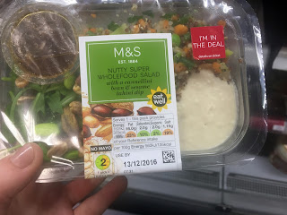
As I wanted to market my packaging at the type of people who shop at M&S and possibly sell it in M&S itself I thought it best to research their packaging and food that they sell already.
The packaging is very minimal, with salads often using a paper sleeve over plastic packaging. Though this is visually pleasing showing the contents of the salads, it is not very environmentally friendly at all. Furthermore, the paper used for the sleeves are also coated possibly with plastic, going against all the findings of my essay as these products will be thrown away after use, and not being biodegradable, may lay in a landfill for years.
When I moved on to the 'super food packaging' I really liked the use of the illustration of the separate ingredients in the background of the label. Once again minimal design is used so that the product itself can be shown off. Because I don't want to use plastics in my practical I cannot do this so perhaps this use of illustrations of the ingredients is a good compromise. Also, the colour green is prevalent in these super food salads to add the connotation of health and happiness from consuming the product. Green also suggests things that are environmentally friendly however from my research for the essay I can see that these packages certainly aren't.
Once again with their sandwiches, they have used illustrations of the individual ingredients to create a patterned background. This creates a folksy handmade aspect to the packaging. Though I couldn't provide a cut out window like these packaging designs the illustrations would make a nice change from the usual type of packaging.
Being slightly disappointed at the quality of packaging design at M&S I tried an independent organic food shop to find more sophisticated packaging. I went to Out of this world who specialise in organic and vegan foods.
The quality of packaging design here was so much nicer but the price reflected this. I found that the better the packaging looked and felt the more expensive the product seemed to be. This raw bread packaging stood out to me immediately. The lino cut style exterior with rustic type gives off a friendly, rustic vibe. The use of tones of green also promotes the health kick vibe and because this bread is all plant based it could represent this too.
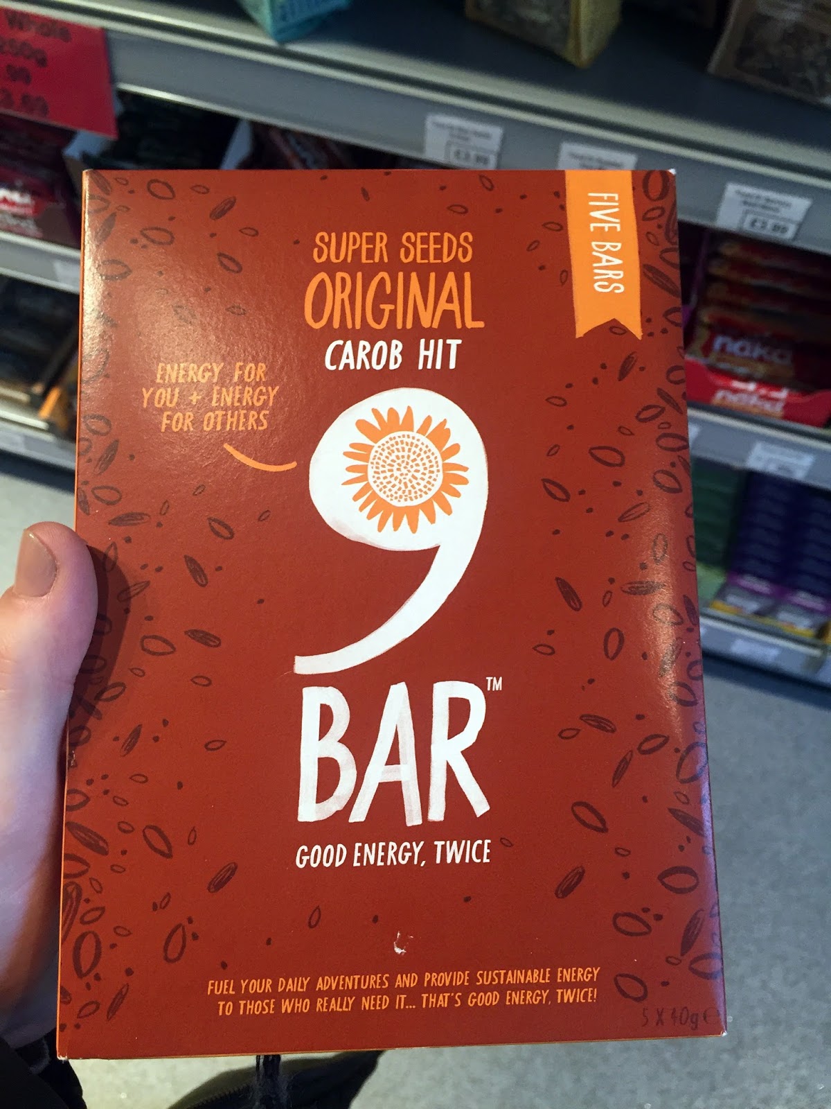
Finally, this 9 bar packaging appealed to me because of the packaging nets simplicity. I feel that the standard box shape is complimented by the rustic use of hand-drawn illustrations and type, making something that may seem boring ordinarily, more interesting. The colours used here are warming and again tones of the same colour have been used to create depth. The use of the hand-drawn type in particular makes it look like someone has written some notes on the packaging just for the customer, making it very personal.
After looking at the current market of healthy convenience foods I found that people need to pay more to improve the packaging's impact on the environment. Also more rustic and hand rendered elements seem to be associated with eco friendly or healthy food packaging.
OUGD601 - CoP Practical - Research into Sustainable Packaging
The designer, Praewarin Bussayajirapong, provided this rationale:
‘Khaohom’ which in Thai, meaning fragrant rice. This project was actually inspired by my home country and the produce we do. Today’s rice packaging are designed only for the convenience of the consumers, or designed to look ‘nice’. If we look through the rice aisle, Plastic is everywhere, it’s cheap to produce, easy to find but it stays with us forever, which means it takes over 100+ years to decompose. Using the traditional practices in Thailand, I searched on some facts and that some bamboos are actually used to cook certain food back in the days. I applied that idea to create a sticky rice packaging that can be reused to cook and store straight in the rice cooker. This type of bamboo also keeps in heat to ensure the sticky rice is served warm for the whole entire day. Now consumers do not need to worry about cooking sticky rice anymore, using this bamboo packaging always cook the perfect sticky rice anywhere and anytime. It is designed to fit in any regular sized rice cookers.I really like this concept of having the package to cook and serve the food in. And her rationale for using less plastic really resonates with my essays findings so far. The use of bamboo means that even if the package was thrown away after use it would mean that it would biodegrade, unlike its plastic alternative. The design itself also represents a minimal and clean aesthetic suggesting it is healthy for you and for the planet.
When Marko was designing the packaging, he states the driving force behind the idea was to create a disposable food bowl with minimum environmental impact and to teach wide society about new biodegradable materials in a fun way. We believe he has succeed and we hope this becomes a trend and we will actually see it used in the future!This packaging though looking simple has a great concept. Seeds are hidden underneath the label so that it can be used to plant when you are finished with the meal. Meaning that this packaging has a life after it has been used for its purpose.
Student Ben Huttly show off his care to the environment through his design project, a biodegradable and recyclable packaging design that uses natural cotton twine in keeping the product and label together. On the other hand, the label is made of biodegradable paper with seed embedded on it. In this way, consumers can not only enjoy the freshness of the products but also plant one on their backyards.This idea of plantable paper is one that I feel is very useful. It means that even if the packaging was thrown into the landfill it would biodegrade and sprout plants. I get an image of landfills full of greenery. This packaging also relates to my findings within the essay as it doesn't use any unnecessary bags or plastic, just a simple string to tie the product together.
Subscribe to:
Posts (Atom)