Showing posts with label Jessy Lanza. Show all posts

Friday, 31 March 2017

OUGD603 - Print Fest Jessy Lanza - Finals & Evaluation


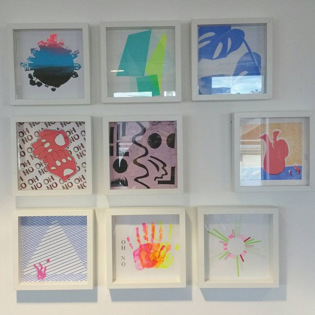
I’m really happy with how the final result came out. I was worried from the positives that it might be a bit boring but I think the experimental method of printing really helped to make the design more vibrant. I think that this style of experimental printing also lends itself well as a visual interpretation for Jessy Lanza’s music. Her music is a bit edgy and different, just like how my print turned out.

I think my interpretation of the song is unique as well, taking the vibrancy of city life and contrasting it against the calm of nature. Overall, I think that this print was really successful and I learnt a lot from experimenting with the inks like this. I think that it works much better than flat colours.


Strengths & What I liked

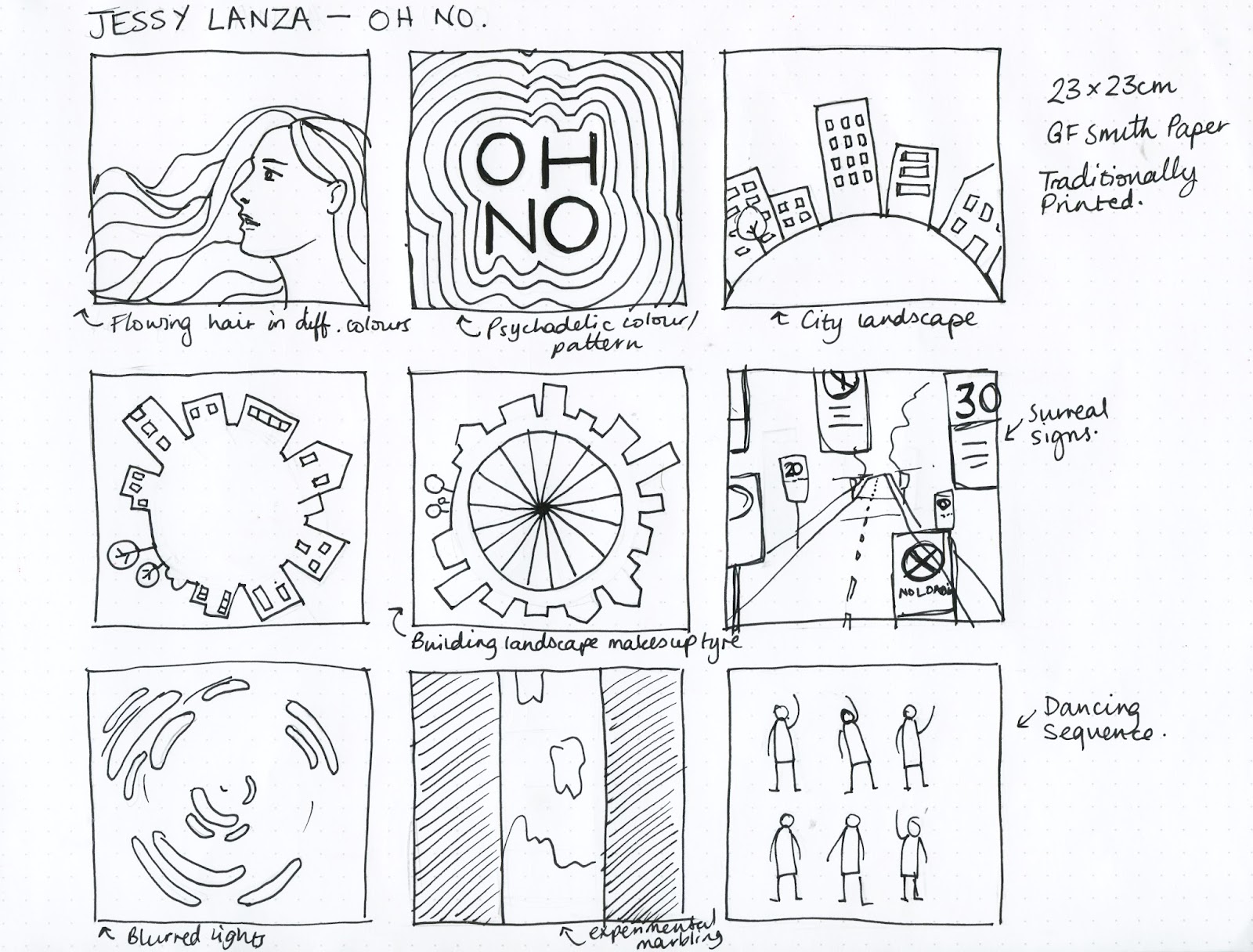
I really enjoyed the traditional print process of this brief, I spent a whole day in the print room just experimenting with the colours and marbling with the inks. This has shown in my final print, I think that it really stands out because of the print processes.


Weaknesses & What I didn’t like

I could have spent more time refining my ideas so that my final design would be more polished. However I think that it still turned out well. There was not a part of this brief that I didn’t like doing.


Time Management

I managed my time really well considering I had a lot of other briefs deadlines on the same week as this. Though my rush to finish the print meant that I printed it on cartridge paper rather than the GF Smith stock due to it not turning up on time.


Final Outcome

I’m really happy with how the final result came out considering my limited time scale for it. Visiting the exhibition and seeing it with the other prints was really inspiring.

Friday, 17 March 2017

OUGD603 - Print Fest - Printing


After exposing my screen I looked into creating the gradient effect that I wanted to achieve, while I had to wait for my screen to dry and post harden. 


The method is actually really simple, you just add the colours that you would like to blend in a line, not letting them touch each other. Then when you pull the ink, they will blend together. The first prints will have clear lines between the colours of ink but as you do more prints the inks will blend more.


The effects that this created were really nice, it almost made the middle of the cityscape look like water or a river. With some of the prints the ink would run off course a bit and create really interesting effects. I believe that the uniqueness of each print that I created made it really hard to choose the one to be displayed because I really like the happy accident that some of the prints had created. 


Wednesday, 15 March 2017

OUGD603 - Print Fest Jessy Lanza - Development

I started out experimenting with the more typographic design to see how it would work. I started out with quite simple colours and type. Then I tried some colour combinations that are a bit more jarring to create that psychedelic effect. I also took inspiration from the letter U print that I looked at, trying to make it look a bit more 3D. I thought that it looked good paired back, however I don’t feel that it represents the vibrancy of the song, and feels a bit static.


So I moved onto the cityscape idea that I had in my sketches. At first I kept it relatively similar to my sketch, creating one side that’s a city and the other that’s almost like a park, creating a contrast of city life and nature. I tried adding colour keeping the cityscape black but I think that it looks a bit strange. Also I’m not sure that much detail for the smaller objects in the scene would come out well being screen printed.

So I went back to being more simple removing the figures of the people. I also asked for feedback at this point and they suggested adding more detail onto the trees as they looked like lollipops when silhouetted. I do agree with this and fleshing them out a bit makes them look a lot more tree like.


After deciding on this final composition I decided to test out some colour combinations that I could use when screenprinting. From my research I decided that it would be good to experiment a bit with the process and try doing a gradient using different colour inks. With the colours I wanted to represent the hustle and bustle in the city compared with the quiet peacefulness of nature. So the colours used in the city area would be brighter and more vibrant where as the colours used in the park bit would be cooler and darker.

OUGD603 - Print Fest - Development

I started out experimenting with the more typographic design to see how it would work. I started out with quite simple colours and type. Then I tried some colour combinations that are a bit more jarring to create that psychedelic effect. I also took inspiration from the letter U print that I looked at, trying to make it look a bit more 3D. I thought that it looked good paired back, however I don’t feel that it represents the vibrancy of the song, and feels a bit static.


So I moved onto the cityscape idea that I had in my sketches. At first I kept it relatively similar to my sketch, creating one side that’s a city and the other that’s almost like a park, creating a contrast of city life and nature. I tried adding colour keeping the cityscape black but I think that it looks a bit strange. Also I’m not sure that much detail for the smaller objects in the scene would come out well being screen printed. 

So I went back to being more simple removing the figures of the people. I also asked for feedback at this point and they suggested adding more detail onto the trees as they looked like lollipops when silhouetted. I do agree with this and fleshing them out a bit makes them look a lot more tree like


After deciding on this final composition I decided to test out some colour combinations that I could use when screenprinting. From my research, I decided that it would be good to experiment a bit with the process and try doing a gradient using different colour inks. With the colours I wanted to represent the hustle and bustle in the city compared with the quiet peacefulness of nature. So the colours used in the city area would be brighter and more vibrant whereas the colours used in the park bit would be cooler and darker. 

Wednesday, 8 March 2017

OUGD603 - Print Fest - Initial Sketches


After watching the music video I decided to sketch down some of my ideas. Because Lanza herself has such a prominent role in the video I did think of doing a portrait of her and then stretching out her hair into different colours to represent the many coloured lights. I also thought about doing a typographic representation of the song, creating a psychedelic like effect with the main lyrics of the song “OH NO” with the colours used being references of the colours used in the music video.

Then I started thinking about the scenery in which the music video is set, in the city. I thought about doing a mundane city landscape with hints of bright colour to reference Lanza. But from the lyrics I get the impression that she is sick of her city life, stating that she’s a worker and then constantly repeating oh no. So I took this idea of the city further, inspired by the bit in the music video where the camera is on the wheel, and made it into a panorama where the city is almost like a planet. I also tried out what this would look like if it was a bicycle wheel. I also explored the use of signs in the video, showing rules and regulations that we all have to follow. I’m not sure how well this would print as I'd probably have to use photographs.

Additionally, I played around with the idea of using the light trails in the videos and putting them in visual form, using the shapes that they create. Perhaps experimenting with marbling using the inks here too. I think after sketching out all of these ideas my strongest are the cityscape ones as I feel I have the strongest reasoning behind it.

Sunday, 5 March 2017

OUGD603 - Print Fest Jessy Lanza - Sketches


After watching the music video I decided to sketch down some of my ideas. Because Lanza herself has such a prominent role in the video I did think of doing a portrait of her and then stretching out her hair into different colours to represent the many coloured lights.

I also thought about doing a typographic representation of the song, creating a psychadelic like effect with the main lyrics of the song “OH NO” with the colours used being references of the colours used in the music video.

Then I started thinking about the scenery in which the music video is set, in the city. I thought about doing a mundane city landscape with hints of bright colour to reference Lanza. But from the lyrics I get the impression that she is sick of her city life, stating that she’s a worker and then constantly repeating oh no. So I took this idea of the city further, inspired by the bit in the music video where the camera is on the wheel, and made it into a panorama where the city is almost like a planet. I also tried out what this would look like if it was a bicycle wheel. I also explored the use of signs in the video, showing rules and regulations that we all have to follow. I’m not sure how well this would print however.

Additionally I played around with the idea of using the light trails in the videos and putting them in visual form, using the shapes that they create. Perhaps experimenting with marbling using the inks here too.

I think after sketching out all of these ideas my strongest are the cityscape ones as I feel I have the strongest reasoning behind it.

Saturday, 4 March 2017

OUGD603 - Print Fest Jessy Lanza - Research

I started looking at screenprints to look for some interesting methods that I could experiment with as well as inspiration for a visual style. 


I really like the colour combination used here, the mixture of pastels and brights creates a really nice contrast. The illustration itself is in a really simple style that lets the texture of the screenprint show. I'm not sure whether this texture was added post screenprinting or created my not applying enough pressure when pulling the squeegee through the ink. 


I really liked the use of the image as text here, especially when the text is so relevant. Also, the combination of blue and red really makes for a striking image. I like the thought of using the shape of the mouth in the position it would be when saying "oh" and "no". 


Going for a more typographic look I found this screenprint of a letterform. I like the way in which a 3D effect has been created using lines, giving the design some depth. The use of the colour behind the letter acts a shadow, forcing the perspective of the letterform forward again making it seem 3D. 


I looked for some more experimental pieces of print and found this use of a gradient in a screenprint. I really like the idea of using multiple inks in one pull to create an interesting, unique effect that couldn't be created with another method. 


Tuesday, 28 February 2017

OUGD603 - Print Fest Jessy Lanza - The Brief

Today Amber briefed us on a poster design for the Leeds Print Fest. It was to create a piece of print to visually represent one of Jessy Lanza's songs as she would be performing at the closing ceremony of the festival. It has to be 23x23cm on GF Smith Pristine White Stock.

There is no limit to what design you produce as long is it is a visual representation of the song "Oh No" by Jessy Lanza and that it is printed using a traditional print method such as screen printing or lino cut.

After being briefed we listened to and watched the music video for the song, which has a very visual style to it, with lots of bright lights and reflective materials.

Music Video:
https://www.youtube.com/watch?v=kaNZbUENKjk

Here are some screenshots from the bits that I liked in the video: