Showing posts with label Starpack. Show all posts

Wednesday, 10 May 2017

OUGD603/602 - Starpack Collab - We got Shortlisted!


We got shortlisted for Starpack! Which means we now have to make the bottle and tin. We have created the bottles using vodka bottles that we bought online for our portfolio. However, these bottles don't match the bottle specifications in the brief so I don't think that we can submit them. But making these bottles has meant that we have a good understanding of how we can mock them up properly. 

After speaking to Amber she gave us the idea of looking for oil bottles rather than spirit bottles for the square bottle we needed. We went to Morrisons and found an oil bottle that was a near perfect match to Bottle B, the bottle we chose. We decided for the shortlist that we would only send one bottle and tin because of the limited time that we were given. 


After getting the right bottle we could stick on the vinyl and paper labels that we had spare from our other physical bottle mock ups. However, we knew the tin was going to be the difficult bit, so we started by measuring the bottle. After measuring the dimensions we created a net. 


It was quite difficult for me to get my head around the slanted bit that was the main factor of interest with the design, but with some help from Laura we managed to figure it out. To make the tin look like tinplate, we got some brushed aluminum vinyl from James in digital print and stuck it directly onto the card and cut the net out of this. 


We were surprised how well this worked, it actually gives the box a really nice finish. Once again we used the clear stickers to add our illustrations to the design. For the lid of the box we use orange GF smith paper to the same effect as the aluminium vinyl. 


The final tin and bottle turned out better than I could have imagined. I think that they do look quite professional considering we were able to make them within a week before shipping them off for judging. The tin lid could have been refined a bit more, it was perhaps a bit big but it still works really well. Additionally, the use of the clear stickers has left some bubbles but there isn't really anything we can do about that. Me and Laura are very confident that this could win our brief category because of how well our physical mock ups turned out. Fingers crossed! 


Saturday, 8 April 2017

OUGD603 - Starpack Collab - Evaluation

Strengths & What I liked

This was one of my favourite briefs to complete because of the branding and packaging elements to it. Laura and I both share the same specialisation so I think because of this our resulting design was really professional and successful.


Weaknesses & What I didn’t like

I don’t think there are any weaknesses with this brief. Because I worked collaboratively it meant any mistakes were fixed because Laura would see them.


Team Work

I think that we worked really well as a team because we shared the same vision for the final design. It also helped that we were in constant communication throughout the design process, checking each decision with each other.


Time Management

In regards to time management I think that we did everything in good time before the submission, we also went beyond the brief to create the cocktail recipe books, which again emphasises we used our time well.


Final Outcome

Overall I’m really happy with the outcome, I think we’ve hit all the pointers in the brief as well as creating a unique and memorable design. I think that the colour combinations we have used make for a really eye-catching design that successfully shows our concept of a visual representation of the flavours.

Friday, 7 April 2017

OUGD603 - Starpack Collab - Final Presentation Boards & Submission

Today me and Laura submitted our Starpack entry. We created quite a few presentation boards in order to explain our brand and design decisions in full. We tried to be as clear as possible in describing and explaining our design with diagrams to show the different finishes that we planned to use. We did want to create the bottle but we struggled to find a bottle that matched the type of bottle we chose. Overall I'm really happy with the outcome, I think we've hit all the pointers in the brief as well as creating a unique and memorable design.  I think that the colour combinations we have used make for a really eye-catching design that successfully shows our concept of a visual representation of the flavours. Also with the use of print finishes of foiling on the labels and embossing it adds a professional and luxurious looking finish to the design, appealing to our affluent target audience.

We worked really well as a team because we shared the same vision for the final design. It also helped that we were in constant communication throughout the design process, checking each decision with each other. The cocktail recipe books were an afterthought that we thought about creating to add to the tins and promote the brand further. But I think the judges will appreciate some more thought into the advertisement of the brand and product.  

We did want to create the bottle but we struggled to find a bottle that matched the type of bottle we chose. Though for the initial submission we feel like the mock-ups are successful in showing our design.


Wednesday, 29 March 2017

OUGD603 - Starpack Collab - Tin Designs


For the tins we wanted something that could be used after you had finished with the bottle. Also we knew from the brief that we had to make it out of tinplate so it would be durable enough for re-use. Our first idea was to use a normal metal tin and engrave the illustrations into the bare metal. The logo and flavour would then be embossed out of the metal tin. Though this idea would work well we felt that the tins themselves were too ordinary and simple. It didn’t suit the sophistication of the brand that we wanted to get across.


We decided to come up with our own unique shape for the tin so that it would really stand out on the shelf. We played with having a slanted lid, so that when you open the tin you can see the bottle peaking out. Also having more of the accent colour on the lid really makes a striking tin design. The addition of the illustrations on the bare aluminium creates an elegant yet contemporary looking tin that is unique to our design. We also brought across the filtered sticker to seal the tin and tie it together with the premium nature of our vodka. Keeping the information to the back of the tin means that we could make the front of the tin, that would be shown on the shelf as visually striking as possible.

Tuesday, 28 March 2017

OUGD603 - Starpack Collab - Feedback

We created some feedback forms to make sure that our designs were going in the right direction and that they were suited to our target audience. Showing a picture of our bottle designs so far we asked 4 questions about our target audience and where they thought that it would be sold.


I also posted on my facebook page in order to get a wider range of people to answer, not just design students.

Overall I think that this was a really helpful experience. It allowed us to confirm that we were going in the right direction as well as getting a variety of feedback in a short amount of time. Most of the people who answered provided the information that we wanted to hear - with the right target audience and the right area for sale. 

Wednesday, 22 March 2017

OUGD603 - Starpack Collab - Bottle Development


After our experimentation session we had a clear idea of what direction we wanted to go down design wise. We used bold lines to separate the information on the labels, with a short description on each. I think that the use of the serifs here really adds to the sophistication. I am not sure about the use of colours however and the positioning of the illustration. Looking back at the research I realised that most of the bottles we had looked at used the designs straight onto the glass bottles.

So we went back and rearranged our illustrations so that they weren’t covering the whole bottle anymore. But, we wanted some more colour as we felt the black and white would not stand out enough on a shelf full of other spirits.
So we looked again at the colours of the fruits and flowers that are our flavours and took inspiration from their colour ways but made them a lot more vibrant. Here we started thinking about shapes that would visually represent the flavours. The easiest was blueberry because we knew it was like a burst of mellow flavour, then for elderflower we chose a petal to represent the floral taste. But we struggled with passion fruit because it is quite a strong tangy flavour we couldn’t think of a simple shape to represent this. In the end we chose a hexagon because we felt that it was complex enough to represent the flavour. We also added colour to the lines of the label to make it stand out from the now bright illustrations. We also tried out a gradient on the glass so that the illustrations appear out of it, however we felt that this made it too busy and complex when we wanted to keep the design simple and contemporary.
After this we decided to minimise the amount of information that we put on the labels, streamlining it so that it only contains the necessary information. We also decided that the use of the bold lines took away from the sophistication of the design so we opted with subtler tapered lines to separate the information. At this stage we also asked people to fill in some feedback forms to make sure that we were targeting the right audience. We asked people where they thought it might be sold as well as the age range and gender who would buy it. Pretty much all the results that we got back were comments saying that they would see the vodka in high end stores such as M&S or Waitrose and that they would appeal to our selected age range of 25-40 year olds with a few minor deviations from this.


So after confirming that we were moving in the right direction we continued to develop the design, refining the positioning of the illustrations and colour combinations. We added a silver sticker to the neck of the bottle to further emphasise the premium quality of the vodka, adding a seal of approval almost for the filtration process.

We also got some feedback to change the type hierachy of the labels - that the brand name should be first rather than the flavour of the vodka. This improves it quite a lot because now it reads how we wanted it to as “Oh blueberry” or “Oh passion fruit” instead of the other way around.

Wednesday, 15 March 2017

OUGD603 - Starpack Collab - Botanical Illustrations

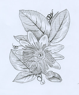
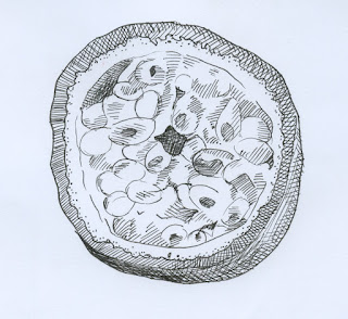
After our day of experimentation we decided to draw botanical illustrations instead as we felt that this would fit our target audience much better than anything that was abstract. We found some illustrations and traced round them using a light box, using hatching to shade them so that they could work in one colour.

I did the passionfruit illustrations as well as one of the elderflower ones while Laura did the blueberry illustrations and the extra elderflower ones.


Tuesday, 14 March 2017

OUGD603 - Starpack Collab - Experimentation

For the designs we wanted to create something that visually represented the flavours so we decided to spend a day experimenting with different techniques to create some interesting visuals to use on the bottles and tins.


For the passion fruit we thought about paint splatters and splashes. We used watercolour paints to splat on colours then blow them out with a straw to represent the explosion of flavour that passion fruits provide. The colours here merged a bit too much a bit too much and the colours weren’t as separated as I’d like it to be.


For the blueberry we immediately thought of bubbles bursting. We remembered something that we did in primary school, putting washing up liquid in paints and blowing with a straw to create bubbles. The effect wasn’t as bold as we had expected, it was really hard to get the defined bubbles without getting too much ink on the paper.


For the elderflower flavour we decided to do some paper marbling with yellow and green inks. We tried to create blobs of colour while winding the green ink through to represent the floral tones of the elderflower.

Though all the processes that we have created do represent the flavours we had chosen, the results are not professional enough to use on our packaging. Therefore we decided to create the botanical illustrations and represent the flavours through different shapes adding a burst of colour to the design, inspired by the Sweet Virtues pacakging we looked at in our research. Therefore the concept plays on the idea of a visual representation of flavours.