Strengths & What I liked.
I have thoroughly enjoyed doing this brief because it is a subject that I’m really interested in. The research stage of the brief was very eye opening because I learned about things I had never heard of like the waste hierarchy. I think the strengths of this project all lie in the final outcomes as well as the ethical design decisions. I tried to make all of the design decisions that I made relate back to sustainability, for example the use of recycled stock on the labels and the decision to riso print the guide. I tried my hand at a bit of art direction, trying to add some more interest to the photographs than just focusing on the design of the labels. It was a really fun experience doing these photographs playing with background colour and positioning.
Weaknesses & What I didn’t like
As mentioned before, Website design is not one of my strong points but I felt that it was necessary to complete the brand. It also allowed me to add more context to the shop so I can include all of my thinking behind why it is zero waste. Also I made some slight mistakes within the guide, however I don’t think they are that noticeable.
Time Management
For this brief I managed my time really well, partly down to the fact that it was the only brief I was working on at that time. It was nice to wind down at the end of the year and focus on one big brief, however.
Final Outcome
The final labels, guide and website all work really well as a cohesive brand together. This project is probably one that I’m most proud of this year because I feel that it promotes a good cause rather being design for nothing. Additionally, the final outcome is all references to an ethical practice that I want to carry through to my professional life.

Showing posts with label Unpackaged. Show all posts
Showing posts with label Unpackaged. Show all posts
Wednesday, 10 May 2017
Monday, 8 May 2017
OUGD603 - Unpackaged Brief - Final Website
I created a range of pages to complete the brand. The landing page gives you an introduction to the store, providing a bit of context. I then created a how it works page so people will know how the store works before visiting. I also included a philosophy page to describe about zero waste and why the store has chosen to get rid of packaging. Then I thought it would be a good idea to create a blog to interact with the customers, giving information about seasonal fruit and vegetables that are available as well as daily inspiration.


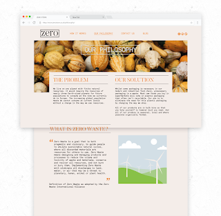

Overall I think that the final website represents the store really well. It has allowed me to add more context to the shop so I can include all of my thinking behind why it is zero waste. I think the use of lots of high quality images on the site makes it feel more professional and realistic. As well I feel like the images of vegetables promote the zero waste lifestyle without being overbearing. Even though this was a last minute thought to create a website I do think that it was necessary to complete the brand.


Overall I think that the final website represents the store really well. It has allowed me to add more context to the shop so I can include all of my thinking behind why it is zero waste. I think the use of lots of high quality images on the site makes it feel more professional and realistic. As well I feel like the images of vegetables promote the zero waste lifestyle without being overbearing. Even though this was a last minute thought to create a website I do think that it was necessary to complete the brand.
Thursday, 4 May 2017
OUGD603 - Unpackaged Brief - Website Development
I did some quick sketches of wireframes that I could use for the site. I wanted a fairly simple site for the content to take centre stage. I think the more minimal layouts are the more successful ones, like the middle layout. I think this will be the layout that I take forward into my digital development. I also thought here about what pages I could create to get all the information that I needed onto the site. I need to talk about how the store works as well as the store's overarching aim of converting people to a zero waste lifestyle. So I decided to have the following pages: How it works, our philosophy, contact us and about zero waste. Between these pages, you could find all the answers to questions that you might ask about the store.


Having an image that stretches across rather than 3 separate images looks a lot more professional in my opinion. But I feel that boxing off the text like this makes for a very static design, it doesn't inspire anything with me.

After looking back at my research for websites, I decided to try something a bit more visual rather than text heavy, having a full bleed image of the vegetables to get the viewers attention. Also, I tried not framing the text here, but now the text feels a little like its floating, it needs more context.

I took a break from creating the main home page and decided to look at the how it works page instead. Again, taking inspiration from the chocolate website in my research I used the icons that I made for the guide to explain how you actually shop. I really like how the icons overlap the imagery like this, maybe this could be a theme throughout the site, to have a large image at the top with the main body of the site slightly overlapping it. Also, the use of the off white as the main colour works a lot better, giving it a more organic colour as stark white feels a bit unnatural.


At this point, I asked for feedback with Alec as I was struggling with choosing a layout as well as figuring out the design. He clarified things for me, telling me the enter page should be the full bleed image with information about what the shop actually is rather than what zero waste is. Not having the quote here and putting the title in a frame really helps to ground the text, making it less floaty. I took this design style across to the other pages, condensing the “what is zero waste” page into the philosophy page after Alec suggested that they would include the same information. This makes the information a lot clearer I think to have it all in one place. Also, the information used is a lot more relevant, explaining how the store works as well as the ethos of having ethical reasoning behind everything. I also thought that it would be good to have a blog to promote the use of seasonal vegetables and other services that the store could provide to make it more active within the community.
Wednesday, 3 May 2017
OUGD603 - Unpackaged Brief - Discussion with Alec
I asked Alec for feedback on my Zero branding project so far as well as feedback on how to progress my website designs further. He really helped me clarify what information needs to be on there and where, showing me that some of the things would be irrelevant.
He also suggested that I should write out my ethos and aims for the store to clarify all the designs further. For example why people should shop at the store, what is the problem that I am trying to solve here. He also suggested that the aim of the store should be to make the transition from normal shopping to zero waste shopping as easy and unnoticeable as possible. The main aim should be to basically to promote anything that avoids the use of our precious natural resources.
We talked about the older generations and their engagement and he had some really interesting suggestions here too. He said I could do a delivery system by bicycle for people within a certain radius of the store so that older people could get their groceries in a sustainable way without having to carry heavy jars etc. Also he suggested that the store could rent out trolleys for the customers to take home, again within reason.
Another thing that I thought about off the back of this would be a recycle bank/food waste bank at the store where customers could drop off their waste before coming to the store, because sometimes some waste is unavoidable. The store could have a place to drop off food waste to compost and get some ready compost in return for the amount they dropped off to encourage them to think about where the waste goes. To add to this community feel I could have a community herb garden where people could gather herbs without using packaging.
He told me to look at how Unicorn Co-op Grocery Store (http://www.unicorn-grocery.co.uk/index.php) works and their ethics in Manchester and base my store's ethics around this. Also we looked at the Co-op and their new initiative to donate 1% of their profits into business ventures and charities in the local area of the store. Anything to support the community. Because at the end of the day you can't live sustainably without a stable community.
After this discussion I have a lot of ideas that I will put to use in the website as well as for the brand of zero as a whole.
Monday, 1 May 2017
OUGD603 - Unpackaged Brief - Store Mock Ups
To add some context I tried to mock ups of the store itself. Trying to work out what it could look both outside and in.


I wanted to keep the storefront really minimal to add intrigue for people walking past. Keeping the same colour scheme of off white, orange and black. I also decided to use a slogan that I have used on my website designs - "Zero waste, zero fuss" as I believe that people would presume going zero waste while shopping would be hard work but it is easier than they may think.


I tried to mock up what the vegetable area might look like, with chalk boards for more information. The colours are a bit off because of the image I used but I think it works well to show how the produce would be placed in the store.
Sunday, 30 April 2017
OUGD603 - Unpackaged Brief - Final Labels and Collateral
I finished the labels, printed and photographed them. I chose a recycled stock for the labels that has grain and fibres in it. I think that the stock works really nicely because of the texture as originally I was planning to use an off white stock like with the stand up labels for the shelves. I thought that these labels could be used next to the bulk bins or if the whole foods were kept in large jars on a table.


Here I tried my hand at a bit of art direction, trying to add some more interest to the photographs than just focusing on the design of the labels. It was a really fun experience doing these photographs playing with background colour and positioning. I think I have definitely improved my photography skills from last year and I am producing some really professional photographs that will look great in my portfolio.


The jars in particular work amazingly on the orange background. Unfortunately I only had an A1 piece of the orange paper so I had to work on the photos a lot in post production to fill out the background. It also meant it was hard to photograph all of the jars on the orange background which is a shame.
Wednesday, 26 April 2017
OUGD603 - Unpackaged Brief - Final Risograph Guide
I picked up my guides from Footprint and I'm really please with how they have come out. The orange risograph ink is a lot bolder than I thought it would be, I think it's come out really nicely. The texture that is created through risograph really adds to the illustrations and design. Because I used the 80gsm recycled stock it does feel a bit flimsy but the thicker stock for the cover makes up for this. I think it would have looked better with a fully orange cover but I like how the burlap sack texture has printed - it would have looked better if it was full bleed but the way that risograph works it wasn't really possible to do this, also it would have increased the cost.

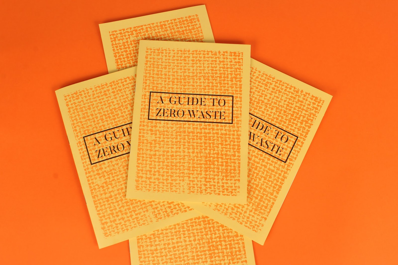


This page is my favourite in the guide because of the icon-like illustrations. I'm super pleased with how the orange and black work together here, they compliment and contrast really well.

I made a small mistake with the illustrations here - with the till I didn't subtract the orange from the black box so it overlaps a bit which is annoying. But I think the effect still works and everything else has come out perfectly.

Monday, 24 April 2017
OUGD603 - Unpackaged Brief - Website Research
I decided it would be best to create a website for the brand to explain the way the store works to people interested in visiting. Even though web design is not my forte I feel like it is necessary for this brand to have one.

The use of the cream and beige tones really compliments the subject matter of chocolate, it reminds me of the colour of white chocolate. Also I really like the use of the simple line illustrations to represent the different elements of the menu. Maybe I could use some of the illustrations that I created for my guide on the website to provide a bit more interest.

I really like the use of the full bleed images that are bright and colourful. These bright images contrasted against the stark white elements of the website create a really poppy feeling. Also there is a lot of empty space on the site, making it very visual rather than being informative. I feel like the site for my store will need to be more informative however so maybe I cannot use this much white space.

This website on the otherhand uses collage like elements to make a really artistic look. I really like how this cut out imagery frames the text and provides more context to the brand itself. Also the combination of types used here adds to this artistic feeling with some hand rendered type contrasted with a sans serif. I'm not sure whether this style would suit my anti packaging store as I have created the aesthetic to be quite minimal, but it is worth trying to add a bit of interest somehow.
Thursday, 20 April 2017
OUGD603 - Unpackaged Brief - Label Design
After finalising the guide and logo I decided it would be a good idea to design the labels that you would stick on the jars once you weighed out your goods. I did a little bit of research just to look at common layouts within labels.
One that really stood out to me was this Summerhill Market branding. They created labels for various items in a very minimal yet effective style. I really like the use of the pastel coloured stock, it draws the eye without being too bright. Perhaps I could use an orange stock for the labels to add a bit more interest and colour to the design. The type hierarchy here also is very balanced, with the product being the most important part, and the logo and price being secondary. Additionally the way things are boxed off makes it feel very neat and organised.

I also looked at a jar label because my labels will most likely be put onto jars, being a durable reusable vessel. This candle again has a very minimal label, separating the information with the use of lines. The one thing I realise with this label is that the white provides a good contrast to the contents of the jar. If I did use coloured stock for my labels it may clash with what is inside. This label is landscape rather than portrait like the Summerhill market labels but it means that it fits better on a smaller jar. Perhaps I should create two labels, one for a large jar and the other for a smaller one so the customers can choose based on their vessels.

So I started designing some labels for some of the wholefoods that would be sold in the store. I started with a landscape label to be compatible with more jar sizes.

I used boxes to designate the information that would be printed, everything else would be the same on all the labels for that product, yet the numbers would be changeable. The layout of this label definitely feels off, though I tried arranging it logically I feel like the order is wrong.

made it so all the information could be placed on one line and it looks a lot cleaner and less jumbled. Also separating the description with another line makes the hierarchy easier to understand.
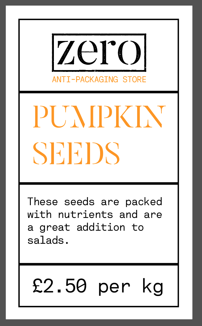
I recreated the label in a portrait manner and I think this hierarchy works a lot better than in the previous design. However, I haven't added the individual weight and price that the customer would pay. This label could be used on the bigger jars or vessels from which you would serve yourself.


Using The Summerhill Market branding as inspiration I added some patterns to the back of the label to frame it a bit and found that it really brings the information forward. At this point I asked for some feedback on the font choices and patterns. There was a consensus that I should change to the sans serif font rather than use the stencil serif for the titles. Also it was suggested if the title was centre aligned then I should centre align everything else, like the description.


I had to rearrange the label so that I could fit the logo on there, placing all the pricing on one line. However I think that it reads better this way, not cramming the description into a small box. Now all I have to do is measure my jars and put the correct information on each label for the corresponding foods.
Wednesday, 12 April 2017
OUGD603 - Unpackaged Brief - The Guide
After playing about with the layouts I decided to keep it as simple as I possibly could in order to let the information do the talking. Also, I hope that once I get it risographed the texture of the print will add a more tactile and organic feeling to it rather than what it is now, being very flat and digital. Saying this though, it could be available as a digital guide to keep paper from being wasted.
See below for the final draft.
Or follow this LINK
See below for the final draft.
Or follow this LINK
OUGD603 - Unpackaged Brief - Colour Scheme
After creating the final logo and doing a bit of research I decided I should think about the colour scheme of the brand. I knew from the beginning that I didn't want the brand to be the run of the mill eco-friendly look with green as the main colour. Though green has the right connotations about being environmentally friendly, I feel like it has been overused within design.
So I started looking for an alternative spot colour as it were to contrast the blacks I have used so far. My first thought was yellow. Yellow is the color of sunshine. It's associated with joy, happiness, intellect, and energy. When I think of yellow I think of positivity. This would work as a background colour very well however I am not sure if I used it on text for example it would be legible or readable from a distance.


So I started looking for an alternative spot colour as it were to contrast the blacks I have used so far. My first thought was yellow. Yellow is the color of sunshine. It's associated with joy, happiness, intellect, and energy. When I think of yellow I think of positivity. This would work as a background colour very well however I am not sure if I used it on text for example it would be legible or readable from a distance.

So I thought what's close to yellow? Orange of course! Orange combines the energy of red and the happiness of yellow. It is associated with joy, sunshine, and the tropics. Orange represents enthusiasm, fascination, happiness, creativity, determination, attraction, success, encouragement, and stimulation. All these emotions are the ones I want to portray so it feels like a good choice to me.

I tried a bright orange as a contrast to some bags that I have placed my logo on and I think that it works really well. I will definitely use orange as my highlight and spot colour from now on.

Subscribe to:
Posts (Atom)