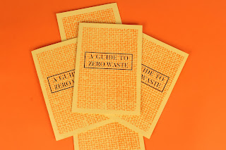
I picked up my guides from Footprint and I'm really please with how they have come out. The orange risograph ink is a lot bolder than I thought it would be, I think it's come out really nicely. The texture that is created through risograph really adds to the illustrations and design. Because I used the 80gsm recycled stock it does feel a bit flimsy but the thicker stock for the cover makes up for this. I think it would have looked better with a fully orange cover but I like how the burlap sack texture has printed - it would have looked better if it was full bleed but the way that risograph works it wasn't really possible to do this, also it would have increased the cost.
This page is my favourite in the guide because of the icon-like illustrations. I'm super pleased with how the orange and black work together here, they compliment and contrast really well.
I made a small mistake with the illustrations here - with the till I didn't subtract the orange from the black box so it overlaps a bit which is annoying. But I think the effect still works and everything else has come out perfectly.


No comments:
Post a Comment