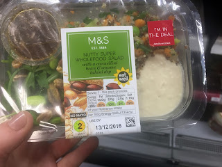
As I wanted to market my packaging at the type of people who shop at M&S and possibly sell it in M&S itself I thought it best to research their packaging and food that they sell already.
The packaging is very minimal, with salads often using a paper sleeve over plastic packaging. Though this is visually pleasing showing the contents of the salads, it is not very environmentally friendly at all. Furthermore, the paper used for the sleeves are also coated possibly with plastic, going against all the findings of my essay as these products will be thrown away after use, and not being biodegradable, may lay in a landfill for years.
When I moved on to the 'super food packaging' I really liked the use of the illustration of the separate ingredients in the background of the label. Once again minimal design is used so that the product itself can be shown off. Because I don't want to use plastics in my practical I cannot do this so perhaps this use of illustrations of the ingredients is a good compromise. Also, the colour green is prevalent in these super food salads to add the connotation of health and happiness from consuming the product. Green also suggests things that are environmentally friendly however from my research for the essay I can see that these packages certainly aren't.
Once again with their sandwiches, they have used illustrations of the individual ingredients to create a patterned background. This creates a folksy handmade aspect to the packaging. Though I couldn't provide a cut out window like these packaging designs the illustrations would make a nice change from the usual type of packaging.
Being slightly disappointed at the quality of packaging design at M&S I tried an independent organic food shop to find more sophisticated packaging. I went to Out of this world who specialise in organic and vegan foods.
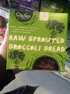
The quality of packaging design here was so much nicer but the price reflected this. I found that the better the packaging looked and felt the more expensive the product seemed to be. This raw bread packaging stood out to me immediately. The lino cut style exterior with rustic type gives off a friendly, rustic vibe. The use of tones of green also promotes the health kick vibe and because this bread is all plant based it could represent this too.
Finally, this 9 bar packaging appealed to me because of the packaging nets simplicity. I feel that the standard box shape is complimented by the rustic use of hand-drawn illustrations and type, making something that may seem boring ordinarily, more interesting. The colours used here are warming and again tones of the same colour have been used to create depth. The use of the hand-drawn type in particular makes it look like someone has written some notes on the packaging just for the customer, making it very personal.
After looking at the current market of healthy convenience foods I found that people need to pay more to improve the packaging's impact on the environment. Also more rustic and hand rendered elements seem to be associated with eco friendly or healthy food packaging.


No comments:
Post a Comment