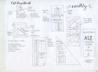
After deciding on going down the route of convenience food, I thought I would choose its biggest offender - lunches to go. So I made a mind map to come up with some names. All of the name ideas had to represent the eco conscious brand that I was trying to create so had to seem 'green' in a way. Initially I was really drawn to the name 'earthly' because it sends a very eco friendly message and I sketched some ideas based on this.
I had done some research into stocks and found some seeded paper that grows plants when you plant it. I thought this would be perfect for my project and even though the degradation of natural plant products creates methane I hope that the growth of the plants will counteract this through producing oxygen. Also because I found that plastics were bad in my essay due to their source from fossil fuels I decided I couldn't use any in my packaging. As sandwich packaging in particular usually has plastic windows to show the sandwiches I thought that a good solution would be to produce illustrations of the sandwiches instead. I also thought about drawing the individual ingredients for a bit more clarity, or producing a purely typographic design. I will experiment with these ideas digitally.
After my sketches I decided that the name earthly didn't really fit. I narrowed the name down to two: bloom and sprout and decided to experiment with some sketches of logos. Though I liked both names I felt that bloom felt a bit more feminine and perhaps like a cosmetics brand rather than a food brand. Also I liked the idea that the name sprout represented what the packaging would do when it is planted. So I chose sprout as the name.


No comments:
Post a Comment