Sunday, 30 April 2017

OUGD603 - Unpackaged Brief - Final Labels and Collateral

I finished the labels, printed and photographed them. I chose a recycled stock for the labels that has grain and fibres in it. I think that the stock works really nicely because of the texture as originally I was planning to use an off white stock like with the stand up labels for the shelves. I thought that these labels could be used next to the bulk bins or if the whole foods were kept in large jars on a table. 


Here I tried my hand at a bit of art direction, trying to add some more interest to the photographs than just focusing on the design of the labels. It was a really fun experience doing these photographs playing with background colour and positioning. I think I have definitely improved my photography skills from last year and I am producing some really professional photographs that will look great in my portfolio. 


The jars in particular work amazingly on the orange background. Unfortunately I only had an A1 piece of the orange paper so I had to work on the photos a lot in post production to fill out the background. It also meant it was hard to photograph all of the jars on the orange background which is a shame. 

Friday, 28 April 2017

OUGD602 - PPP - Herd Leeds Digital Job Fair

Today I attended the Herd digital jobs fair at the First Direct Arena to see if they had any design jobs available. I really liked all the wayfinding that was around the venue, the branding for the jobs fair was really bright and playful, it was actually part of the reason why I went to the fair. 


When I got in there I was a bit lost in where to look. There was a lot of big corporate companies there like Jet2, Asda and Barclays. I was a bit scared to approach any of the tables but I saw one with design on the banner and asked. They told me they have a graphic designer currently, just the one, so they weren't looking, even when they were advertising design. 


After this all the tables I looked at were mainly looking for people in software development, UI/UX design or QA testers. I thought I might find a few more design positions but I realised because it was a digital jobs fair the majority would be more digital based jobs. I suppose the problem is I am looking for a design job that is print based, and the digital jobs fair wouldn't advertise any print based jobs. 


So I left a bit disappointed but realised that it probably wasn't for me because of the specialism in design that I have taken this year. I think it was good experience though to go to a fair like this and seek people out, forcing me to network. 

Wednesday, 26 April 2017

OUGD603 - Unpackaged Brief - Final Risograph Guide

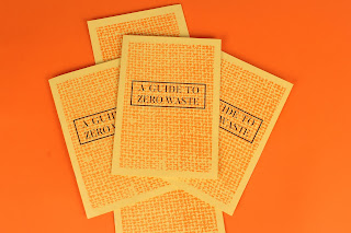
I picked up my guides from Footprint and I'm really please with how they have come out. The orange risograph ink is a lot bolder than I thought it would be, I think it's come out really nicely. The texture that is created through risograph really adds to the illustrations and design. Because I used the 80gsm recycled stock it does feel a bit flimsy but the thicker stock for the cover makes up for this. I think it would have looked better with a fully orange cover but I like how the burlap sack texture has printed - it would have looked better if it was full bleed but the way that risograph works it wasn't really possible to do this, also it would have increased the cost. 


This page is my favourite in the guide because of the icon-like illustrations. I'm super pleased with how the orange and black work together here, they compliment and contrast really well. 


I made a small mistake with the illustrations here - with the till I didn't subtract the orange from the black box so it overlaps a bit which is annoying. But I think the effect still works and everything else has come out perfectly. 


OUGD602 - PPP - Design Strategy Presentation

The main aim of the presentation was to show my progression as a designer throughout the time that I have spent at University as well as my plans for the future. I based the actual design around my personal branding, using the same colour, shapes and typefaces that I have tried to use throughout my branding. 


  • I’ll start by talking about my personal branding. Looking back at my branding from second year I appreciated the print process but felt that it didn’t represented me as a designer. I wanted to create something that was more playful as I have tried to develop a more playful style within my design.
  • I played with the shapes of my initials to create shapes that act like confetti. I feel that this design is a lot more ‘me’ than last years design.  
  • (Show business cards)

  • I have also updated my portfolio site, which I have created through My Adobe Portfolio. I wanted to have an accessible portfolio online so using this platform was really helpful when I didn’t know how to code. 
  • I try to update my social presences as much as possible to connect with professionals and other creatives. I have been keeping up to date with my Behance this year and I’m really proud with the amount of attention my work has been receiving.


  • Overall I’m really proud of the work that I have produced this year. I think that it is clear that I have developed my own style. 
  • My favourite projects this year have been the packaging briefs, so I am glad that I specialised in doing branding and packaging briefs for this year. I have found that this is what I would like to do in industry. 
  • If I was to choose my favourite brief I think it would be DBA, because I really enjoyed creating the packaging and patterns. Also I found it so helpful getting feedback from industry professionals and I think that it was a really good experience to meet the directors of companies and get my foot in the door as it were.


  • I feel that I have become more confident in my abilities as a designer and as a creative. I can present a lot better than when I first started and feel that my skills have progressed really well too.
  • I found what I wanted to specialise in at the end of second year and focused on them.
  • I have really tried to be pro-active about finding a job after graduation, the result of this was numerous interviews and I have made some good contacts at Craft Agency. 


  • I have found it difficult this year juggling briefs with design work for the students’ union and executive officer meetings. A lot of my spare time has been spent with the student union but I am glad that I applied myself to something good like this.
  • The dissertation was probably the most challenging part of the year but I feel that my hard work paid off as I got a grade I was really happy with. 
  • I have found it a challenge going to interviews as well as trying to contact people for placements. I sent out Christmas Cards with my CV in at Christmas in the hopes of getting a placement at a design studio, but to no avail. In fact I never heard back from any of the studios I sent the cards to.


  • I feel that this year my networking skills weren’t that great.
  • I could have had much better time keeping when it comes to blogging and documenting work. 
  • I also regret not using the facilities more, and experimenting with them for a brief. I feel like I should have taken advantage of my last year here trying everything out but I feel like I have had no time for this. 


  • Here is a selection of my favourite pieces that I created at Hallmark.
  • I learnt a lot about illustrating commercially on my placement. I found it really interesting to be in an environment 
  • It made me realise how important it is to design for an audience and not for myself. I think this was an important lesson to learn because unless I’m doing a self initiated brief I’ll never be designing for myself, I’ll always be designing for a client. 
  • Experimented with new techniques that they used within the studio like foiling & flitter.


  • I have been offered a month internship at Robot Food, a branding and packaging design agency in Leeds. I hope from this I could get a junior design role at Robot Food or a similar company. 
  • I was also employed as a Freelance Designer for Hallmark so hopefully I will get some work from them.
  • If all of the above fails then I’m not sure! I want to stay in Leeds as I feel like it is a wonderfully creative city. There are plenty more studios I could apply for. The main aim is to get a job!


OUGD602 - PPP - Final Portfolio

Having completed and photographed all of my projects for this year I updated my portfolio with my newest work. This makes the portfolio a quite long but I feel that I can always cut out some of the projects if need be. I'm quite pleased that it shows my choice of specialism in branding and packaging. Also, not to brag, but I feel that the work that I have created this year is of a professional standard and I'm really proud of how polished my portfolio looks.

See the updated portfolio below or follow this link to view on issuu.


Tuesday, 25 April 2017

OUGD602 - PPP - Personal Business Cards

My business cards arrived from Moo.com today and I'm really impressed with how they have turned out. They came wrapped in this lovely little package with a ribbon and "wax" seal. 


The print quality on them is perfect and the stock itself feels very tactile giving that extra feeling of quality. I'm pleased I went for the rounded edges because I think that it gives the business cards that extra it of playfulness and friendliness. 


Here you can see the duplexing, which I'm surprised how well it matches my colour scheme. Also I really like how when they're all lined up they create this unique pattern on the side. 


Monday, 24 April 2017

OUGD602 - PPP - RAW Studio Talk


The Creative Director from RAW, Rob Watson, came into to talk to us today, going through how he went about setting up his own studio, his past and some of the work that RAW do. The name of the studio actually comes from his initials.

The reason that he set up the company was to have fun, and challenge himself. He said that a Mark Twain quote inspired him: "Twenty years from now you will be more disappointed by the things that you didn't do than by the ones you did so. So throw off the bowlines. Sail away from the safe harbor. Catch the trade winds in your sails. Explore. Dream. Discover."

He said that he learned more from his failures than he had from his successes, which was really inspiring to hear a professional say it is alright to fail. And also that your environment has a huge impact on what you produce and what you do. A nicer environment means better more exciting work.

He made the decision to complete change the work environment for the studio - he reached a point where he just decided enough was enough, rather than commuting 30 hours a week to having a studio in his own home. He said it was the hardest decision he has ever made but the best one he has made to improve his life and happiness. It was really nice to see someone talking passionately about design, who isn't doing it for the money, but for the love of design itself.

He then went onto to talk about their self-initiated projects, saying that it was the best and most promising work that they have done. It is what made their name big on online blogs like Form Fifty Five and Creative Bloq.

http://weareraw.co.uk/work/jims-scarf-project

One of the first examples was Jim's Scarf Project, a website where they promoted an artist's project to knit 400m of scarves to cover his building. They created the website for free simply because they appreciated the project that Jim was doing. He linked this back to doing good and therefore feeling good. The more good that you do the more it comes back to you. This is really inspiring, showing that helping the community can really bring good things to you.


Another project that was self-initiated was about thinking about where your turkeys come from. This really resonates with my beliefs and it was nice to see a studio really thinking about their values and real issues happening in the world. They also tried to use humour and positive thinking to persuade people to think about this issue without guilt-tripping people. Off the back of this, the vegetarian society asked them to create some work for them about the benefits of being vegetarian.

The one piece of advice that he gave us was to be your best, not the best designer that there will ever be but the best version of yourself. It was refreshing to see someone talk about things like this because I feel like in the industry it's very dog eat dog. Overall it was just really nice to see work that wasn't corporate and had real values and meaning behind.

Finally, he talked about Make Work Play, a company that they set up to create their own products and projects for a bit of fun. They launched a children's book called "Len Legsworth" to add subtle truths to a children's book. They self-published it to independent bookstores in Manchester, London and online. I really like the idea of being able to create your own products, after all they do have so much experience at advertising other peoples products, why not advertise their own.

Another great peice of advice that he had to give us was that good things take time. He asked us to guess how many times people like Walt Disney were rejected. Things don't happen immediately, you must be patient. He left us with a simple message:

"Have fun and make it up as you go along"  

OUGD603 - Unpackaged Brief - Website Research

I decided it would be best to create a website for the brand to explain the way the store works to people interested in visiting. Even though web design is not my forte I feel like it is necessary for this brand to have one. 


The use of the cream and beige tones really compliments the subject matter of chocolate, it reminds me of the colour of white chocolate. Also I really like the use of the simple line illustrations to represent the different elements of the menu. Maybe I could use some of the illustrations that I created for my guide on the website to provide a bit more interest. 


I really like the use of the full bleed images that are bright and colourful. These bright images contrasted against the stark white elements of the website create a really poppy feeling. Also there is a lot of empty space on the site, making it very visual rather than being informative. I feel like the site for my store will need to be more informative however so maybe I cannot use this much white space. 


This website on the otherhand uses collage like elements to make a really artistic look. I really like how this cut out imagery frames the text and provides more context to the brand itself. Also the combination of types used here adds to this artistic feeling with some hand rendered type contrasted with a sans serif. I'm not sure whether this style would suit my anti packaging store as I have created the aesthetic to be quite minimal, but it is worth trying to add a bit of interest somehow. 

Thursday, 20 April 2017

OUGD603 - Unpackaged Brief - Label Design

After finalising the guide and logo I decided it would be a good idea to design the labels that you would stick on the jars once you weighed out your goods. I did a little bit of research just to look at common layouts within labels. 

One that really stood out to me was this Summerhill Market branding. They created labels for various items in a very minimal yet effective style. I really like the use of the pastel coloured stock, it draws the eye without being too bright. Perhaps I could use an orange stock for the labels to add a bit more interest and colour to the design. The type hierarchy here also is very balanced, with the product being the most important part, and the logo and price being secondary. Additionally the way things are boxed off makes it feel very neat and organised. 


I also looked at a jar label because my labels will most likely be put onto jars, being a durable reusable vessel. This candle again has a very minimal label, separating the information with the use of lines. The one thing I realise with this label is that the white provides a good contrast to the contents of the jar. If I did use coloured stock for my labels it may clash with what is inside. This label is landscape rather than portrait like the Summerhill market labels but it means that it fits better on a smaller jar. Perhaps I should create two labels, one for a large jar and the other for a smaller one so the customers can choose based on their vessels. 


So I started designing some labels for some of the wholefoods that would be sold in the store. I started with a landscape label to be compatible with more jar sizes. 
I used boxes to designate the information that would be printed, everything else would be the same on all the labels for that product, yet the numbers would be changeable. The layout of this label definitely feels off, though I tried arranging it logically I feel like the order is wrong. 

made it so all the information could be placed on one line and it looks a lot cleaner and less jumbled. Also separating the description with another line makes the hierarchy easier to understand. 


I recreated the label in a portrait manner and I think this hierarchy works a lot better than in the previous design. However, I haven't added the individual weight and price that the customer would pay. This label could be used on the bigger jars or vessels from which you would serve yourself.


Next I played around with using a different coloured stock. The off white in my opinion works a lot better than white at making it less of a stark contrast and warmer. Also making the lines less bold by using a dashed line rather than a solid helps in breaking up the text without detracting from the design.
Using The Summerhill Market branding as inspiration I added some patterns to the back of the label to frame it a bit and found that it really brings the information forward. At this point I asked for some feedback on the font choices and patterns. There was a consensus that I should change to the sans serif font rather than use the stencil serif for the titles. Also it was suggested if the title was centre aligned then I should centre align everything else, like the description. 


Moving on I tried some different colour combinations, trying to add more of the orange accent colour into the design. I also tried what the label would look like on a bright orange stock for a flash of colour. I think that the full orange label is a bit too much, the offwhite with the contrast of the black and orange works a lot better. 

I went back to the landscape label designs after looking at jars as on the small 250ml sized jars a portrait label would have to be tiny and wouldn’t fit any information on what so ever. So taking the layout from the portrait labels I tried to fit it in a landscape format.
I had to rearrange the label so that I could fit the logo on there, placing all the pricing on one line. However I think that it reads better this way, not cramming the description into a small box. Now all I have to do is measure my jars and put the correct information on each label for the corresponding foods.