Me and Laura decided to find some inspiration in the form of current vodka bottle designs. We were looking for contemporary looking yet luxury designs.
We really liked the simplicity of this bottle. The use of the matte black contrasted with the gold creates an effortless sense of sophistication. The paired back label makes you focus on the illustration and name of the brand rather than any of the extra information. Also, the fact that most of the bottle is covered by this black gives a sense of mystery, intriguing the consumer.
We also found this range of flavoured vodkas and spirits by Good Bones Studio. We really liked the use of storytelling within the illustrations on the labels, relating to the name of the flavours. Also this minimal, limited colour palette really compliments the Scandinavian vibe that they have created.
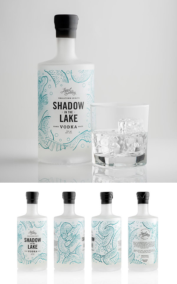
What we really liked about this bottle design was how the design is printed straight onto the glass of the bottle so that the illustrations interact with the contents of the bottle. Also, this gives it a really sophisticated finish paired with the matte glass. Additionally, the use of coloured line art like this adds colour without overpowering the simplicity of the bottle.
In a contrast to the illustrative design we looked at before we found this dipped bottle design. This very minimalist design puts the emphasis on the craft of the bottle and the spirit. Even the labels are very paired back perhaps to let the product itself shine over the design. I do really like the organic lines that the act of dipping the bottles has created, they almost look like landscapes.
I found this packaging design that I really liked. Even though it isn't anything to do with vodka, I was just struck by the playfulness of the patterns. The use of the geometric pops of colour contrasting against the super realistic botanical illustrations creates a very quirky finish. It also creates a really nice visual representation of the flavours that each of the truffles are. However they have used the same illustrations on all of their designs and just changed the colour ways to match the colour of the flavour. For our designs we could use the correct illustrations for each flavour.


No comments:
Post a Comment