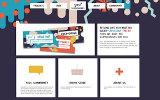
I was tasked with taking the branding through onto the website to create the community forum that we had talked about previously. I started with quite a minimal design to reflect the logo and let everything else stand out.
However when I took this to my group they suggested that I brought the patterns through into the website as well to make it look less static. Though they did like the simple layout of the site in general, especially the forum part.
I started by adding the patterns onto the top bar and making the background match the base colour of the pattern. I think that this immediately ties in better with the packaging designs that we have created, making the brand more cohesive.
When I asked my group for feedback, Emily suggested that I bring down elements of the patterns into the background. This helps with making it look less static and it was suggested that these elements of the patterns could move as you scroll through the site. Also the aesthetic of it is a lot more flexible and less rigid than the patterns being cut off.
I decided to add extra elements that overlap the text boxes, again with the plan that these elements would move as you interact with the website making it more tactile and less static. I think that this design has greatly improved and fits a lot better with the rest of the collateral that we have created. Though I am not usually a fan of website design I feel that the outcome is really successful.


No comments:
Post a Comment