Wednesday, 28 December 2016

OUGD603 - YSS Posters - The Brief

Students’ Union Brief Title: “Your Student Survey” 


The College wishes to improve upon the success of student feedback by running a College wide campaign.

The campaign will aim to increase awareness and engagement on the importance of student feedback, focusing on improving response rates to the Your Student Survey [YSS]. The main aim of the campaign is to ensure that students understand the importance of giving feedback in the College’s Your Student Survey.

We would like you to produce a distinctive and exciting visual design for the Your Student Survey. Your designs should provide a consistent visual identity to promote the value placed upon the student voice throughout College.

Please take note of the previous years’ creative advertising campaign. Your design should be centred on incorporating the following phrase:

LCA life is: ______?

Please note, the complete campaign includes multiple different phrases in this format. Keep in mind that the design should be transferable with different phrases.

The successful designer[s] will be asked to produce artwork for a range of print and screen based deliverables that will be taken through to professional production. All design work will be used throughout the Colleges efforts to promote the campaign to all Level 4 and 5 students.

This is a fantastic opportunity to gain experience working on a client led brief and to see your work displayed throughout the College. The successful designer[s] will be awarded £250.

The deadline for all submissions will be 5pm January 9th


Background & Considerations 

Your Student Survey [YSS] is a survey initiated by the College, asking students to provide feedback on a range of areas and aspects of their experience whilst studying at LCA. The YSS is open to all Level 4 & 5 students giving students the opportunity to provide honest feedback about their learning experience in College.

Using your experience as a student at Leeds College of Art, how can you create an exciting design to interest students?

What do you find visually appealing?

How can you create an attention grabbing promotion?

You may need to consider the application of your visual concept to a promotional package comprising of:

- 7ft x 2ft banner

- 200cm x 80cm roll banner

- A0 Poster

- A3 Poster

- Web page & social media

- Digital media – for example gifs/animations

You will therefore need to consider responses that work across a range of scales and media.


Submissions

Please submit at least one A3 poster design in order to be considered.

Your completed designs should be submitted as a 300 dpi PDF or JPEG by email to student.union@leeds-art.ac.uk – Alternatively, feel free to WeTransfer all files to our email address.

The deadline for entries is the 9th January at 5pm.

Tuesday, 27 December 2016

OUGD603 - SU Elections - Guide Development


After completing the posters we moved onto creating the guide. The SU said that they really liked the layout of the guide from last year so they just wanted to alter it to fit to the new RUN theme. I took the design of the posters and flyers and applied it to the cover of the guide, flipping the lined gradient to mirror on the back page which is a nomination slip. Also I tried to make it more fun by alternating the coloured strip at the bottom, matching the titles.


Overall, even though I didn’t have much creative freedom with regards to the layout I think that I have successfully made a playful, colourful guide that would grab people’s attention. I do think that the illustrations go a long way to making these guides successful, it was nice to be able to be supplied with the artwork so we could have a quicker turn around. Additionally I think that the print quality of the guide makes a difference - being printed at Pressision the colours are as vibrant as on screen emphasising the playfulness of this campaign.

Tuesday, 20 December 2016

OUGD603 - SU Elections - Poster Development


I went back to the drawing board, making the text as big and bold as possible within the design. I also started playing around with big blocks of colour contrasting against white to imply even more movement, like the logotype is running up a hill. I also took the idea of chevrons from my research and used them in the design to further emphasise the important information. Also we decided to change the colour palette completely, based on the illustrations that Adam had done as we felt that the colour scheme was brighter and would stand out more on the noticeboards.


After this I developed this idea further, experimenting with the use of chevrons and various other shapes to suggest movement. The SU really liked the use of lines to infer movement next to the logotype so it became part of the design. After a lot of emailing designs back and forth we stuck with the final idea of creating a gradient out of lines. All the important information is highlighted by the use of chevrons which I think works really well. We also decided to do 3 different 1 colour posters based on the 3 colours that had been used for the figures.


Monday, 12 December 2016

OUGD601 - CoP Practical - Sprout Final Packaging


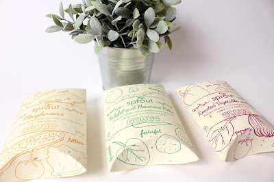
The final sprout packaging printed out really successfully. I was concerned that the seeds in the paper would disrupt the ink but it worked out fine. I feel like the design looks really professional, and I could see it popping out on the super market shelves. I feel like the final packages work well as a trio together, with the colours complimenting each other. The aesthetic that the seeded paper produces is really rustic and tactile, making you want to feel the paper. This will certainly add to the novelty of this packaging and I would hope that this would attract people to pick it up who might not ordinarily be interested in this type of product. Although this provides some sort of future for the food packaging industry, thought still needs to be made into how we use, and sometimes abuse, packaging. But as Papanek rightly pointed out sometimes the packaging is indeed the product so I don't believe that there can be a future completely without food packaging. 


OUGD601 - CoP Practical - Sprout brand development

After completing the packaging part of the project I decided to create a little bit of an online presence for the company sprout. It makes sense to do it digitally because a print campaign would be unsustainable. So looking at innocent smoothies I tried designing a really visual website. 


The result, I feel, is very uninspiring and static. I tried to liven it up with a patterned background but I think it is the use of the photos in such a rigid structure. I want the website to feel playful and fun to entice its target market and as it stands this design portrays neither. 


Looking at one of the websites I found during the anti-packaging movement research I was inspired by their fun and active layout. The logo and navigation bar stay static but the rest scrolls. They also include fun illustrations that makes the site seem more personal. I will try a similar layout with my website design. 


I wanted to keep the green colour scheme because of its connotations of being environmentally friendly so instead I used tones of green as well as duotoned images to add more depth and interest to the site.


The home page is kept quite simple and minimal with the main products front and centre. Like the Lunzer site I decided to go with a static logo and navigation bar at the side and keep the rest movable. 


As you scroll down more content is revealed in little post it note-esque columns. Splitting the information up like this allows users to view lots of information at once rather than having to go find it through the navigation bar. Though you can still go to the individual pages through the navigation bar I think that this way people will find information they aren't necessarily looking for. 


I altered the quote on the first page a little after some feedback saying that I should reflect the packaging and use the same font choices. 


Next I made a page with the diagram for planting the paper so it is clearer for people to read than small on the back of the packaging. I also decided to add some muted tones to make it pop more. I tried to add a bit of interest with hands pointing rather than arrow heads but I feel like it doesn't really fit with the clean style that is used within the illustrations. I also felt the positioning of the arrows leading to the next stage was a bit clumsy.


So I changed the arrow heads back to a more traditional minimal style as well as organising the layout a bit better to be clearer. Overall I'm really happy with these pages, if I had more time I would produce the whole website however, I would like to produce a short motion graphic/infographic video that could be used on social media to gain traction for the cause and raise the much needed awareness. 

Saturday, 10 December 2016

OUGD603 - SU Elections - Initial Development


I started by trying to develop a logotype for the campaign that was visually interesting enough to be used on its own as well as in the posters and flyers. I wanted to create something that really stood out and grabbed peoples attentions as the posters will be up around college in areas where people generally walk past. My favourite is definitely the 3D type because of how much it stands out, creating the illusion of it coming out of the page.


So I took the chiselled logotype through to my initial poster designs. I used a similar colour scheme to what was used in figure 1 of my research. I wanted to focus on the text because that is the most important part of the call to action. I really worked on trying to get the right type hierarchy so that the most important parts would be read and understood even when just walking past the posters on the noticeboard. 


I played around with having the text italicised to imitate movement as well as scattering the letterforms a bit to invoke more playfulness in the design. After looking at these designs after a short break I decided that some of the information wasn’t really needed, like the paragraph of text because you should be able to read posters at a glance, so having this paragraph of smaller text is pointless. Therefore I changed around the design to remove the paragraph, giving more room for the possible use of illustrations. I think that this layout is a lot more coherent and easier to navigate than the others because it only contains what’s needed, nothing more. 


At this point I sent my initial designs to the SU and went in for a meeting to discuss them. The feedback they gave was that they liked the type choices however they felt that the chiselled effect made the logotype too static. I do agree with this because things would be chiselled in stone, so it really doesn’t imply something that’s quite active and fun. They did however like the italicised version, even exaggerate it further and said I should take this forward without the 3D effect. The main feedback that I received, however was that I should just add more movement as long as the eye was drawn to RUN first.

OUGD601 - CoP - Synthesis between written and practical

For the practical side of this research project, it was decided to explore one of the biggest issues within food packaging waste: convenience food. Convenience foods such as pre-packed lunches use packaging that is designed to be thrown away immediately after the product is eaten, and not always in a responsible manner. It is necessary to find a much more sustainable solution to this issue where the consumer will be made aware of this waste problem. Looking at pre-packed lunches first, research was done into the current market and what materials are used. It was found that most of the products used a mixture of paper and plastics, which was found to be unsustainable in its current form.


After some more research into sustainable packaging solutions that have been tried and tested, it was decided to go for a simple material option that would be more affordable and environmentally friendly, than some of the more innovative solutions. As found previously, plastic was a bad choice in the eyes of Papanek(1971 & 1995), Wallace (2016) and Miller and Alrdridge (2012) due to its unsustainability. It was for this reason that a seeded paper was chosen - the material is created from recycled, unbleached papers with natural seeds embedded into the paper. The paper may be planted and watered, plants will sprout out of it, creating new life. Also, if the paper was to be thrown away and taken to landfill, consumers could have peace of mind that it would indeed biodegrade fully and furthermore any paper thoughtlessly disposed of has a chance of growing a plant (this could include poppies, lavender etc.). As it was found that much of the waste from lunches is disposed of on roadsides, this would be a big environmental bonus.

For the product and brand itself, it was felt that something that was as eco-conscious as it’s packaging would be appropriate, and so it was decided to create vegetarian and vegan sandwiches, that were healthy for the consumer as well as the environment. As a basis for the consumer research, the Innocent smoothies brand was used to understand what tone of voice and target audience should be used. It was evident that the product would benefit from a specific target audience in order to succeed, and because of the fun element of the packaging, parents and their children were chosen. The product can educate both parent and child about waste as well as giving a fun activity for them to do together, when planting their packaging. Not only is the packaging more responsible but also it is hoped it will raise awareness for the growing waste problem and the environment. The main aim is to kick-start the change in lifestyle that is needed in order for the climate to get better and hopefully encourage consumers to be more responsible about their packaging use. Papanek (1971 & 1995) would support this idea, as it will instil these values of eco-consciousness and responsibility onto the next generation, who is our future.

The brand is called ‘Sprout’ as it represents the act of the plants growing out of the packaging and it can also be used as a word to describe young children. This playful name also lends itself to an environmentally friendly outlook, to give the impression of greenery and nature. It is a high-end lunch product that would be marketed at eco-conscious and health conscious parents. The stores that it would be sold in would be places like Waitrose, Marks and Spencer’s and perhaps independent retailers.

However, because the packaging was chosen to be made out of paper, it means that when biodegrading it will release methane, one of the leading greenhouse gases (Miller & Aldridge 2012 pg.27). So while it my not be the best material there is hope that the plants grown from the paper will tackle this as they absorb greenhouse gases through photosynthesis and release oxygen. Also the packaging could be argued to follow the cradle-to-grave model as it is after all designed to be thrown away, however it does not use virgin materials and offers some respite from the waste issue by biodegrading quickly and easily.

Wednesday, 7 December 2016

OUGD603 - SU Elections - Initial Sketches


I started with thinking about the logo that I could create. I thought about doing some sort of iconography to represent running in the elections however I couldn't really think of much apart from a running man or a chevron so I thought about creating some more dynamic type instead. I really like the idea of having the chiseled effect to make the type more 3D and jump out the page at you. Next, I sketched out some ideas for the posters and flyers. I thought of perhaps doing a running track with the type along it. Or maybe playing with the placement of the type to make it imply movement. I also thought of using arrows within the design. I'm going to try and mock these up digitally and then send them over to the SU for some feedback on which direction they prefer.

OUGD603 - SU Elections - Research

After being briefed I started by looking for some playful and colourful designs to get some inspiration for my own designs.


I really liked the complimentary colours used in these designs. Also, I liked the interactivity that the spaces provided on the postcards this fits the brief of encouraging people to get involved. Additionally, the simplicity of the sans serif type and iconography works really well here, drawing the eye without being too busy.


These posters are what the SU wanted the officer roles to look like. They liked the use of the text framing the page and drawing your eye around it as well as the boldness of the colours. Again the simplicity shines through here, not having a complex design letting the illustrations and text do the talking. 


These series of posters really inspired movement. The use of huge chevrons draws the eye on and on and on to the next poster. I also really like this contrasting colour palette that they have used, perhaps in my designs I could have a series of posters like this that linked together. 

Tuesday, 6 December 2016

OUGD602 - PPP - Christmas Cards

Today I printed out some simple Christmas cards that I designed to send off to studios that I admire. The design I made is simple, yet a little cutesy and I hope that it represents me as a designer. I plan to send these out with my hotdog CVs in in the hope of getting a response back from the studios. 


After receiving lots of feedback on my CVs I feel like this version is a lot more "me" in its design. The Hotdog CV also folds out to be a poster with one of my favourite quotes from Henri Matisse with the same pattern I have used on the other side. 


I tried to add a more personal touch by doing a bit of hand lettering on the envelopes as well as on the inside to wish them a Happy Christmas. I also signed them off as "from your secret admirer, Hattie Windley" to add a bit of humour. 


Monday, 5 December 2016

OUGD602 - DR ME - Cut me out

My final zine was based on the male gaze and sexism within society and looking at various advertisements from the magazine cut outs we were given. I used collaging, pairing images together and working back over the pieces with drawing and type.

I'm actually really happy with how the zine turned out in the end, for quite an experimental process I really enjoyed completing the task.