Monday, 31 October 2016

OUGD603 - Homelessness - Visit to St George's Crypt

Today I went for a meeting with Kim Parkinson, who is responsible for most of the events to aid the members of St George's Crypt and teach them skills. I had a quick tour around the facilities and learnt a lot about what they do. I found that they mostly work with people who are struggling with addiction problems or are on benefits unable to find a job. The Crypt opens up at night and sleeps 45+ people who have nowhere else to go. During the day it acts more like a community centre for people to wander in and out of and get the support that they need.

After the short but sweet tour, I met with Kerri from East Street Arts who does an art-based workshop every Monday at 1pm. She has been working there for a number of years and showed me some of the previous projects she had created with the members of the crypt.

I discussed my ideas with her that I wanted to do some sort of print-making but wasn't sure about the logistics of it - whether the members would be allowed scissors/lino cutting tools. This is because I have done workshops in the past and know that health and safety can be an issue. But she informed me that it would be fine as they are all adults they can handle themselves. Additionally, she liked the idea of lino cuts as she hasn't tried that with them so far. I found that the workshops that work the best are ones that are simple and easy to pick up.

I sat in on the session doing paper marbling - which I found really fun and the members found great fun too, getting really involved with it. The simple nature of using the ink and letting the magic happen as it were was really enjoyable. Kerri said that the session was the most they have engaged before so they created lots of marbled pieces.


I created some marbled paper and used it to create some cards as an example for them to work with for the next session. 


My initial idea after the session is to continue with my idea for the lino printing as I feel like the bold results will work really well. I am not sure whether to go for a theme or let them do what they wish. I did want to challenge some issues of mental health, perhaps asking people to do prints of an emotion they feel or don't want to feel. But this might be too touchy for some of the members who go to the art sessions to get away from their problems and use it as a distraction or a solution rather than bringing it all up again.

My next step is to talk to Kim again and discuss my ideas so far to see what she thinks. I have filled out a volunteer form so I might volunteer at some more of the art sessions if possible because I really enjoyed myself.

Thursday, 27 October 2016

OUGD603 - Lifting Tower Projection - Stills for Sequence

We got re-briefed after being shortlisted for the final groups. We found that the brief had changed slightly due to the client's requests. Instead of having a series of 1-minute animations we were told that we were to make a sequence of different animations each 5-10 seconds long. So this means that any narrative that we could have included are pretty much gone. This was slightly annoying as we had spent time storyboarding and developing stories to tell, only to be told that no one will be watching for that long.

However, the feedback that we got from the initial proposal was that they liked the shopping couple idea and our light sprites idea, so these are the main ideas that we will work with going forward. 

After the briefing, we got back into our group and chatted through what we could do by simplifying our current ideas. We were also told that we had to have an illustrator in our group, so Katie joined us who was previously working on her own. With all our different styles and colour palettes put together, we thought we should do something to mesh together our sequence more so one of the first things that we decided on was to have a consistent colour scheme throughout all of the animations. This means that the whole sequence will be more cohesive. Looking at Katie's initial sketches we really liked her simple yet bold colour palette of red, green and white. We thought that they are suitably festive and would add a definitive style to everything. 

I split up my couples animation into a variation of different scenes that would work at 5-10 seconds long. I still wanted to keep the shopping theme somewhere so decided that one of the short animations should be them shopping. 


I also came up with some more festive and kind of cutesy ideas to create a little narrative of this couple together. I thought that something that would be visually interesting was a stargazing scene. 


Also, the ultimate cheesy festive tradition, the mistletoe felt like it belonged within my short narratives.


I also came up with some simple ideas to animate that could be used as fillers. I really liked the idea of using the pattern of a Christmas jumper but animated. 


Additionally, I worked on a more typographic idea for the light sprites as I thought it would add another easy element to animate. Plus because the light sprites were one of the clients favourites I thought we should include more of them. 


OGD601 - CoP - First tutorial

My first tutorial for CoP went really well. I have been researching over summer and decided my question or at least had a pretty clear ideas of what I was doing by the end of last year. So my plans are pretty clear for the essay so far. Richard commented on this too - saying that I have a very clear and easy question to work with.

He suggested that I do narrow my question down to food packaging rather than all packaging because it gives me a good focus. It also means I can narrow down my research to specifically food packaging. As well as meaning that my practical outcome will probably be a piece of sustainable food packaging.

After this tutorial I feel confident in starting my context and theory section of the essay and I plan to have the majority of this section finished by the time I have my next tutorial.

Friday, 21 October 2016

OUGD602 - PPP - Emailing Studios

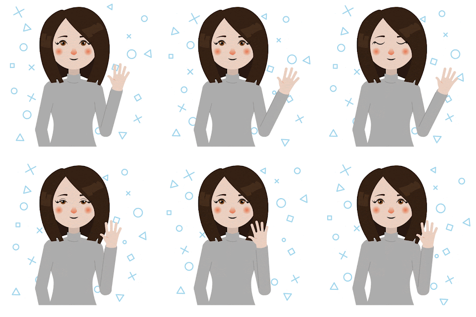
To try and set myself out from the crowd with the vast amount of emails that studios must have to read daily I created a small gif portrait.

I felt that my first attempt was quite static. Also, the wave that I created seemed too stiff and jittery, probably because of the lack of frames I had used.


I added more frames to the arm movement as well as making the background less static. Additionally, I added a blink animation to make it seem more human! To say that this is only one of my second attempts at actual animation I'm pretty proud of the results. 

Hopefully, this will make my emails more readable and set myself apart from any other emails from people asking for a placement. I have sent emails to Robot Food and Split so far so I am just hoping to hear back from them now.

OUGD603 - Penguin - Children's Book Research

For the Children's book "The Secret Diary of Adrian Mole" I want to create something really playful or humorous to represent the book itself. It is written in a laid-back style in the format of a diary so it's very personal. I want to take some of the key elements of the story and portray this in illustrations on the cover perhaps.


I really like this use of imagery to create letterforms, I was thinking I could replicate this with his name on the cover but not all of the text because I think that would be too overpowering. Also, I quite like the limited colour palette and how it is limited.


This combination of type and illustration really suits the context of this book.  The typography jumps off the page at you. I really like the personal touch with the hand written blurb too, it makes it seem as if George has written the label himself. If I could try and find an object from the book to use in a similar manner that is pivotal to the story. Flicking through the book I was thinking that I could use a tube of spot cream as the quintessential life of a teenager is acne. 


After going to waterstones to do some primary research I found this book, The Beginning Woods, in the teen section. I really liked the simplicity of the cover, using the silhouetted illustration to frame the type. Something like this could be used like Adrian's red socks from the book to have the type in. 


Even though there isn't actually a description of Adrian Mole himself in the books I thought that I could do a typographic representation of a portrait of him. I could go off the TV adaptation of the character that does have glasses making it more distinct as the character a lot of people know and love. 


Wednesday, 19 October 2016

OUGD603 - Penguin Design Awards - The Brief

The penguin random house book design awards have been announced and they seem really interesting this year. I am thinking about doing the children's book, but I am not sure about the other two.

Children's:
The Secret Diary of Adrian Mole Aged 13¾ by Sue Townsend

'Saturday January 25th

10 a.m. I am ill with all the worry, too weak to write much. Nobody has noticed I haven’t eaten any breakfast.

2 p.m. . . . Perhaps when I’m famous and my diary is discovered people will understand the torment of being a 13¾-year-old undiscovered intellectual.'

Adrian Mole’s painfully honest diary is a hilarious spots-and-all glimpse into the troubled life of a teenager. First published in 1982, it quickly became a best-seller and has since been adapted for radio, television and theatre.

I feel like the fiction and non-fiction books will be particularly difficult because of how popular they both are. They have each had lots of re-designs so creating one that will be unique will be a challenge. With the children's book, I feel like I can explore my illustrative practice to create something playful and fun. I am not sure about the other two as they are far more serious. 

Monday, 17 October 2016

OUGD603 - Creative Networks - Evaluation

Strengths & What I liked

The part of this brief that I really enjoyed illustrating and creating the pop up Hellboy for this brief. Having something to interact with and take home was really important to our concept.


Weaknesses & What I didn’t like

I think that our main weakness was to not take our concept throughout all the visual outcomes. If we had combined the visual memories idea in our posters we may have had a better submission.


Time Management

Considering we were given a very short timescale for this brief me and Laura were proud of what we had created for just the two of us.


Team Work

Though we both had other commitments we made time to get together and create our concepts and designs. We worked really well together and because we are friends the communication was good between us. Also we tried to play to our strong skills for each part of the brief, so Laura focused on the posters and I focused on the souvenir idea.


Final Outcome

Our finals we felt all followed our theme well, showcasing the artist or speaker rather than our design skills. We tried to make the information as clear as possible. I was also really proud of our pop-up Hellboy, I thought that it was a really fun addition to create visual memories for people visiting the talks. Unfortunately, we got emailed that we didn’t get picked but we got some really valuable feedback about the design and issues regarding copyright and printing.

OUGD603 - Creative Networks - Final Proposal

For our final concept to create something different we went with creating visual memories for both the speaker and the guests involved. This would materialise itself as souvenirs to take away after the event.

For the posters themselves we wanted to keep it really simple and straight to the point. We wanted all the information to be there so you would have no questions about where, when or how to book the event. So we wanted a minimal theme to go with this. We decided to create tactile screen prints to advertise the event. These will be on coloured stock to add a bit of luxury that can't be gained from a digital print.

See the presentation boards that we created below:
Unfortunately, we got emailed that we didn't get picked but we got some really valuable feedback about the design and issues regarding copyright and printing. It was noted that while the screen printed posters would indeed add that bit of luxury they would be difficult to print at busy times and for deadlines. Perhaps one off screen prints for each event would work, but not a whole range of them. They also really liked the visual memories concept however said that we may come across problems with copyright for using Mignolia's character or other designers work.

Overall considering we were the smallest group to apply to creative networks I am proud of what we achieved in the short timescale given. If I was going to do the brief again I don't think that I would change much other than try to refine the ideas further.

OUGD602 - PPP - Looking for Placements

I have started looking at studios that I could do placements at in January. I've been looking for somewhere that suits my design ideals and methods. Also I would like to find somewhere in Leeds if possible so I can stay in the city after I have graduated.

Split
www.split.co.uk


Split are a small, creative-led design studio based in Leeds, UK focusing in both printed and digital collateral. Their description of themselves is how I would like to describe my own practice:
Our ‘style’ is our ideas. We don’t simply focus on one trend or aesthetic, but rather on concepts that reflect our clients and what makes them unique. We then execute those ideas in the most appropriate and engaging way. We hope this makes our work as diverse as we are.

One of the projects that I really liked that they have done is a brand identity for a vegan bakery.


I love the typographic posters, they remind me of the frame project that I did in first year. Additionally I appreciate how versatile they are doing both print and digital media and would hope to learn this too.

Analogue
www.madebyanalogue.co.uk/


I first found out about analogue when someone came in to talk to us in college. Since then I have loved their approach to each brief as well as the slick looking outcomes. Their statement says it all really:
We’re analogue. We believe design is there to be enjoyed, whether you’re creating it or observing it, and this is reflected in our work: playful, tactile & always creative-led.
Each of their products are really unique, playing to the clients rather than a personal style. My favourite of their works so far is a themed menu for the restaurant Cielo Blanco. They've created these rustic, sort of naive, illustrations to mimic the style of Mexico.


Robot Food
www.robot-food.com


Robot Food is an agency in Leeds that specialises in branding to tell stories. However their portfolio is full of food packaging which has been a big interest of mine. This drew me to them and made me want to get in touch. 
A brand with a strategy can shape the future.
In order for a brand to thrive, or even survive in today’s market, it has to have a purpose that resonates. The game has moved on since the golden age of TV and people aren’t happy being labelled as ‘consumers’ any more. With so much choice, we’ve all got preferences and we only believe in brands with clear values that strike a chord.
We help a brand know who they are and how to communicate. Getting to the heart of a brand and understanding people is essentially how we work. Led by brand values, we create authentic brand expressions and tell the truth in compelling ways.
Their packaging designs are all playful and colourful, making you want to grab them off the shelves. The one project that really stood out to me is their most recent food packaging design. I love the use of the handmade brush elements to reflect the same handmade ethos of the food.


Sunday, 16 October 2016

OUGD602 - PPP - Manchester Print Fair

This weekend I had a trip to Manchester to visit the Print fair and parts of Design Manchester 2016.

Print fair

My first stop was the print fair at London Road Fire station which was a fantastic venue. There was a lot more stalls than any of the other years I have visited. I always like going and seeing what kind of prints sell, as well as being inspired by all the different design and illustration styles. 

I managed to talk to a lot of the store owners and found out how much it was to have a stall there. I was thinking I could work towards running my own stall at the print fair next year, it would make me progress with my traditional print practice and I think that it would be a great thing to be involved with. It's only £80 for 2 days which is an achievable amount to make from some prints. 


Alan Kitching Pop-up Exhibition

Next I visited Fred Aldous where they were showing some of Alan Kitching's letterpress work for the guardian in the window. I loved the mixture of colours that he used from dark colours to fluorescent ones.  It looks as if they were hand printed rather than set in a chase in order to create the texture and layout of each of the posters. 


I particularly like the words that he printed onto newspaper because I feel like it adds a texture that could not be gained from anything else. I found it really inspiring being able to see his sketches and part of his work process too showing that he has a pretty clear vision of what he wanted to create. 


Saturday, 15 October 2016

OUGD603 - Creative Networks - Pop Up Hellboy

We had an idea to provide a souvinier at the event that people attending could take home and keep as a memory of the event. We immediately thought of doing pop-out Hellboy figurines for Mike Mignola and sketched out how it would work.


I started by trying to draw Hellboy in quite a simple style, fleshing out shapes first and then adding detail. However  I feel that it is already looking very flat.

So I found an image to use as a reference that is a lot more graphic and 3D.


After a lot of work, mostly on shading I finished the hellboy illustration ready for the pop out. I had to cut off his arms and create stubs for the arms to stick to for our split pin idea to work.


But the final outcome actually works really well! The weapons that he has are a bit oversized but unfortunately we don't have much time to solve this issue. But overall I think that this idea works really well, I think it's definitely something I'd be excited about, and even a talking point at the networking event before the speakers start. 


Thursday, 13 October 2016

OUGD603 - Creative Networks - Finals

We didn't have time to properly print the posters how we wanted to (i.e. Screen print) We mocked them up to create the same sort of texture and provide a picture in context for the proposal hand in.
Our final posters all followed the same structure of simple imagery and text to make them as clear and concise as possible. 


We also mocked up a gif of a proposal of a moving image to start the presentation. We created a simple gif, which is perhaps a bit too fast, but could be easily altered if we are chosen. 


Also we created the souvenir pop out Hellboy, which I'm really proud of. It's my first time illustrating a character like this so I think that the outcome is really good. Also logistically and structurally I am surprised how well it works. 


Monday, 10 October 2016

OUGD603 - Creative Networks - Poster Development

For the posters we wanted to use a really simple layout that would showcase the artist or speaker while creating a consistent theme throughout all of the posters for Creative Networks. 

Mike Mignola

We started with the Mike Mignola ideas by using almost a comic book cover style, with the imagery taking precedent within the design. The use of a monochrome colour palette also works really well here, giving the poster a real graphic impact. This style suits the context of Mike Mignola but I'm not sure whether it would suit any other speakers. 


So we moved onto a more linear layout, again letting the illustrations and imagery do most of the talking. I really like how the eye is drawn down the page with this poster. However there is not much information on the event, but this would pique interest. 


After realising that we should include a bit more text and information on the posters we created a layout that including more focus on the type hierarchy. So the most important bits would be read and understood first - who is speaking and when. This layout actually works really well, however I'm not sure about the block of text at the bottom, perhaps it needs to be split up a bit. 


We finalised this layout, moving all the important information to be central as well as making the logos a bit smaller to give more space for the text. We also refined our type choice in this design, keeping it to two different fonts: Avenir and Garamond to streamline the design. We were really lucky with Mike Mignola that there was so much imagery that we could use. We might struggle using a monotone design with the next speaker but we will see.


Wes Anderson


For our "fictional" speaker we chose Wes Anderson because both me and Laura really appreciate his work and because its supported by LIFF it's quite relevant. We chose a pink backdrop because of his most recent film: The Grand Budapest Hotel, which featured lots of soft pink tones. As I had thought we struggled finding imagery with this design. I tried halftoning Wes Anderson himself and using that as the central image but it just didn't work as a monotone image. 


So instead we tried to find imagery that represented his films. Again based off his most recent film, The Grand Budapest Hotel, we chose the brand of sweets that is sold within the hotel and involves the main characters. This imagery creates a nice centerpiece as well as intriguing viewers. I think that this shows that our layout is really versatile and can work for any speaker. 

Previous Speakers


For the Previous Speakers poster we decided to stick to the same layout to make the designs more cohesive. Again using a coloured back drop and white design we put the names into a path of the logo. So that all of the previous speakers are contained within the logo. I'm not sure whether this reads clearly but I think it works really well visually.