Saturday, 12 November 2016

OUGD603 - The Little Art Collection - The Brief

THE BRIEF

The theme for our Spring/Summer 2017 collection is ‘Interests and Hobbies’ (music, sport, literature, dance, travel, etc.). This collection is about appealing to parents’ personal hobbies and interests and creating fun designs for them to enjoy with their babies. We’re looking for artists to create illustrations/paintings/drawings around our ‘Interests and Hobbies’ theme which can later be worked into repeat patterns for textile baby products such as blankets, bed linen, accessories, etc.

Almost all of our products are unisex so artists should consider this when choosing their ‘Interests and Hobbies’ subject matter. Our target audience are most likely to be affluent men and women aged 25-35 years and affluent women aged 55-65 years buying gifts for new parents.

They provided some illustrations which I imagine is the style they are looking for, however, I feel like I couldn't replicate this watercolour style digitally, but I am going to experiment with some different illustrations. Also they have mentioned that they are open to any technique so I may try my usual vector style. 


Hints & Tips:

- We’re looking for art that communicates e.g. passion, emotion, nostalgia, movement
- We’re open to any technique, from watercolour to graffiti!
- We like work with lots of colour (too much black can make patterns harsh)
- Keep it simple – lots of detail makes it hard to work images on a smaller scale
- A nice clear/well defined outline is important (watercolour, fine liner, etc.)
- You might prefer to submit a single illustration or to set a scene/number of scenes with your work
(conversational pieces are well suited to the market)
- We’re trying to move away from the typical baby print (but please don’t forget that babies will be
using and enjoying these products with their parents)
- We’re looking for art that works for both baby boys and baby girls (unisex)
- As a brand, our focus is on creating quality products for our customers

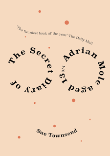
OUGD603 - Penguin - Adrian Mole Initial Designs


Even though there isn’t actually a description of Adrian Mole himself in the books I thought that I could do a typographic representation of a portrait of him. I could go off the TV adaptation of the character that does have glasses making it more distinct as the character a lot of people know and love.

I had an idea to recreate a messy bed as I feel this is often what is most associated with teenagers - a messy room. I plan to develop this design further by adding objects onto the bed that are relevant to the book and the time era that it was written in. I do like this composition however I do feel the type is a bit lacking, it needs to stand out more against the bed background. 


I played on the idea of creating an actual diary cover for the book. But I do think that this might not be that successful as I feel it would be a common design amongst the entries. Although I do really like the use of the hand rendered type here, it makes it lot more personal as if Adrian had written it himself.  


I tried paper cutting a design similar to my first idea of using his glasses and hair. I liked the simplicity of this design, however I am not sure about the use of typography. When I asked for feedback for this design they said that it looked too much like Harry Potter rather than Adrian Mole because of the messy hair and glasses. 

I also had this idea to create the type out of spot cream, because this is what I associate with teenage angst. I found a spot cream that was used in the 1980s and recreated it digitally. The main problem was when it came to the type however, I couldn't seem to get it to look 3D and when it looked 3D is was a bit illegible. I tried various types, drawing it out and using fonts but I don't think it works as well visually as I had hoped. 


If I had more time on this project I would try and actually create the type using some cream and then photographing it but I'm trying to complete the brief within 2 weeks. 


Thursday, 10 November 2016

OUGD601 - CoP - Edible Packaging

Skipping Rocks Lab have created one of the world’s first edible water bottles made using seaweed to get rid of plastic bottles once and for all. Their reasoning according to their site is that the consumption of non-renewable resources for single use bottles and the amount of waste generated is profoundly unsustainable. The aim of Ooho is to provide the convenience of plastic bottles while limiting the environmental impact. Though still in the early stages of development this product is promising for the future of bottle water. The capsule is completely biodegradable and can be eaten whole too resulting in zero waste. The process for creating the blob of water is called sphereification and has been used in a range of edible products such as bubble tea.


This too shall pass
Is it reasonable that it takes several years for a milk carton to decompose naturally, when the milk goes sour after a week? This Too Shall Pass is a series of food packages where the packaging has the same short life span as the foods they contain. The package and its content are working in symbiosis
 
Oil package
A package made of caramelized sugar, coated with wax. To open it you crack it like an egg. When the material is cracked the wax do no longer protect the sugar and the package melts when it comes in contact with water. This package is made for oil-based food.
 
Smoothie package
Gel of the agar-agar seaweed and water are the only components used to make this package. To open it you pick the top. The package will wither at the same rate as it’s content. It is made for drinks that have a short life span and needs to be refrigerated, fresh juice, smoothies and cream for example.
 
Rice Package
Package made of biodegradable beeswax. To open it you peel it like a fruit. The package is designed to contain dry goods, for example grains and rice.


Tomorrow Machine is a Swedish design studio that creates food items with packaging comprised of caramelized sugar coated with wax, which melts when it is used or when it comes in contact with water. This clever method again allows the products created to be fully sustainable without leaving any waste behind.


They also created packaging for smoothies using agar jelly as the 'carton' which may not neccessarily be edible but is still 100% biodegradable. This is also able to be printed on which means that there will be still room for packaging designers even if the packaging becomes completely different. 


Tuesday, 8 November 2016

OUGD603 - Extended Practice Crit

Penguin
- Really liked the unmade bed idea, would look better with items on it related to the book.
- The cut out design looks too much like Harry Potter with the messy hair and glasses.
- The diary might be too stereotypical
- Talked about spot cream idea, they liked this and suggested I could try it with a tube of toothpaste or even papercut it.

Lifting Tower Projection
- Amber's personal opinion was that it the people looked like aliens being green
- Told to blog about the struggles with the brief changes. 
- Liked the simplicity, not much feedback to give other than the limited colour scheme. 

Sunday, 6 November 2016

OUGD602 - PPP - Thinking about Employability

The first task was to think about the online presence that we have at the moment. Having worked on my portfolio site recently for applying to work experience, I feel like it is pretty polished at the moment.


Below is my feedback from my portfolio site, instagram and facebook page. I found all of this feedback really helpful because I don't often get feedback for my personal profiles, I just make them! So to hear things that I should improve or continue doing is really valuable.

I realised that I do neglect my facebook page so I do need to keep updating this with WIPs and keeping people looking. As I did get a job from this page before so it would be worthwhile keeping up with appearances.

Also, the consistency through all my profiles is a good point as I have different images of myself and haven't updated my branding on some of them.


Another task that we had to do was write down our anxieties about our work within a "stinky fish". This task was meant to surface our anxieties so that they didn't hold as much reverence being kept hidden.  Sharing these anxieties with everyone else I found that a lot of us had the same thoughts. I think I get this mental block with my own work and it made me feel a bit better getting things out in the open. 


Wednesday, 2 November 2016

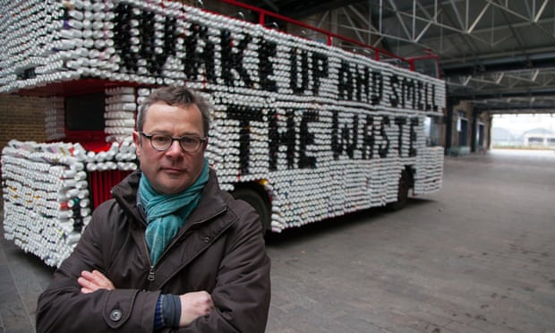
OUGD601 - CoP - Hugh's War on Waste Series

In my initial tutorial, it was recommended that I watch Hugh's War on Waste, a documentary about Britain's waste, from food waste to clothing waste. I finally got round to watching the whole series last night and found it really quite enlightening. 

The first programme focused on the supermarket's cosmetic standards for fresh grown vegetables. They have strict rules on the size and shape of each vegetable to be suitable for sale. In the programme, Hugh found that supermarkets such as Morrisons believed that consumers wouldn't buy vegetables they didn't fit their specific cosmetic standards. Therefore all the fresh vegetables that didn't fit the rules were simply left the rot in huge piles because the farmers couldn't sell them. Even though all of the vegetables were perfectly edible.


This shocked me because there are so many people who struggle to pay for food and go hungry, yet perfectly good vegetables are going to waste in huge piles like above in every harvest. By the end of the series we were shown that there have been more tolerance and lessening of restrictions on grown vegetables due to a petition but out at the time of the show. Due to this many supermarkets, today have "wonky veg" packets where they will now sell vegetables that would have otherwise been rejected. However, this is only for vegetables like potatoes, carrots, parsnips and onions. There is still a huge issue surrounding this with other grown vegetables. It does show however that the consumer is the one who has power over these things, if we don't express interest for them then they won't be sold.

Another thing mentioned was food waste from our own households. Approximately a third of all the food we buy gets thrown in the bin without being used at all. This can only be solved through people making a more conscious effort not to buy more food than they need. As well as not throwing things away prematurely. 

However, the thing that shocked me the most was about take away coffee cups. Everyone, including me, presumes that they are recyclable because they are paper cups - why wouldn't they be able to be recycled? But this is one of the coffee industries biggest secrets. They're not at all recyclable. In fact, they are horrifically unsustainable. I found out that coffee cups are actually coated a with a plastic (polyethylene) coating on the inside of the cup in order to stop liquid from penetrating the paper. This stops the cups being able to be pulped in the usual way paper would be recyled as the plastic clings to the paper and gets mixed up in the pulp. What is worse is that because there are exposed seams in coffee cups the paper that is used to make them has to be virgin - meaning that new paper from trees must be used. Resulting in the paper for a single purpose, only to then be thrown away into a landfill. In fact, 2.5 million cups are thrown away, and only 1% of those cups get recycled. In the program, Hugh found only one recycling plant in the UK that could recycle these cups. And this was just a trial system. 

OUGD603 - Lifting Tower Project - Change in Brief

After the proposal was submitted the brief changed. Rather than doing a one minute animation we were asked to make a sequence of 5-10 second animations instead. This meant that any narrative that we had tried to make went out the window. Also having a meeting with the people from Lumen, the projection company we were collaborating with we found our designs had to be simplified a lot. This news was a bit disappointing as it meant completely reworking all of our work. 

So I reworked my couples into shorter scenarios and made them silhouettes to avoid losing too much detail through the projection process. I also worked on a short sequence of an animated Christmas jumper pattern. To make our group’s animations have a theme we decided to all use the same limited colour palette of red, green and white. Any black would be shown as the bricks on the tower. These colours also feel Christmas-y without being too cheesy. 


I changed my couples illustrations to silhouettes because the detail would have been lost in the full colour state. Also this would remove any issues of diversity. I am quite annoyed about this change because it means that we can have no narrative whatsoever now, my couple animations will be disjointed and not really mean anything.