Tuesday, 6 December 2016

OUGD602 - PPP - Christmas Cards

Today I printed out some simple Christmas cards that I designed to send off to studios that I admire. The design I made is simple, yet a little cutesy and I hope that it represents me as a designer. I plan to send these out with my hotdog CVs in in the hope of getting a response back from the studios. 


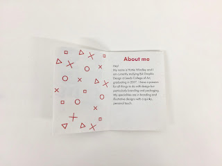
After receiving lots of feedback on my CVs I feel like this version is a lot more "me" in its design. The Hotdog CV also folds out to be a poster with one of my favourite quotes from Henri Matisse with the same pattern I have used on the other side. 


I tried to add a more personal touch by doing a bit of hand lettering on the envelopes as well as on the inside to wish them a Happy Christmas. I also signed them off as "from your secret admirer, Hattie Windley" to add a bit of humour. 


Monday, 5 December 2016

OUGD602 - DR ME - Cut me out

My final zine was based on the male gaze and sexism within society and looking at various advertisements from the magazine cut outs we were given. I used collaging, pairing images together and working back over the pieces with drawing and type.

I'm actually really happy with how the zine turned out in the end, for quite an experimental process I really enjoyed completing the task.


OUGD602 - PPP - Hotdog Book

After recieving feedback that the hotdog CV I had created was a bit too formal and represent me as a person I changed it to be a bit more personal. I took out all of the job stuff, like experience and added more illustrative elements, as a sort of "This is me" book rather than a CV. I also printed a fold out poster on the back with my favourite quote about being creative so that the people I send this out to might keep it a bit longer. Overall I think that it's a nice thing to post out with the Christmas cards I have made so that people can get to know me a little and hopefully get in touch!


OUGD603 - SU Elections - Briefing

It is coming up to the Student Elections for the exec officers so I was briefed by the SU to create a new visual identity for the elections. They decided that they wanted to keep the same identity every year from now on so it becomes familiar to everyone rather than having something new every year that students might not recognise.

Their requests were that bright colours should be used and it should be creative and playful yet simple. Their main aim for the campaign design was something that would call students to action. They told me that they have already come up with the theme so I don't need to think about it. The theme/title will be "RUN!" so you "RUN in the student elections".

Deliverables:
- A5 Flyer for President Role
- A6 Flyer for all of the officer roles
- A6 Booklet for all of the officer roles inc President
- Posters for Campaign and President
- A full visual identity with colour palette, logo and type.

I had to do this all within a relatively short turnaround, sending initial designs by Friday. They set up some research for me to look at and said that Adam will be doing the illustrations for the individual officer roles.


After the briefing I knew that I wanted to create something with a strong typographic style like my Fresher’s branding. Also they said within the briefing that they would like something playful again so I will try and replicate this through my designs. Additionally because of the name they have chosen I know that the design must have movement and look energetic to encourage people to take part.

Sunday, 4 December 2016

OUGD602 - PPP - Zine Workshop with Kristyna Baczynski

Today I attended a zine workshop with Kristyna Baczynski, a local illustrator, at the etsy made local fair. She started by giving us a quick overview of what a zine is as well as her rather large collection of zines. Below are a few examples of my favourites.


I really liked the illustration style in this zine and the message that it was trying to get across about the mundaneness of life. Though it had no text it could be read visually, it was really nice to put your own interpretation on something.


The illustrations in this zine were beautifully laid out in comics with equally as qbeautiful messages. It also shows how well a one colour zine can work. 


There were a couple of these vibrant concertina zines that I would argue aren't zines at all. They contained really bold and bright illustrations with seemingly no narrative to them. But the context in which they were created makes them a zine rather than an illustration. 


This zine was my favourite because of the printing process, content and style. The combination of blue and red is very common in illustration I feel but they combine really well. It was all about supernatural things, my favourite page was the one with the cats as familiars. There was just so much character in such a small zine. 

Next it was time to have a go at making our own! She showed us some quick book binding techniques to make a saddle stitch or a staple bind. Then gave us this zine about zine making, containing content pointers, binding methods and much more.


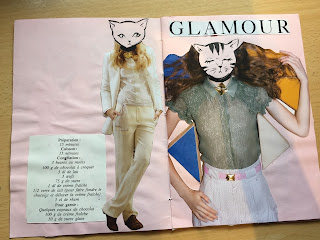
After being inspired by the cats in the Supr Natr zine I decided to do a zine on cats! She had loads of print out of illustrations and magazines that we could collage from. So I decided to take women's figures and draw cat heads on them to anthromorphise them. I named it Feline Fatale as a play on Femme Fatale.


Overall it was a really fun workshop, I learnt a lot about zine culture and how its okay to make whatever you want, however silly it may be. It was really inspiring to be with like minded creatives too and just generally have fun with something.

Saturday, 3 December 2016

OUGD601 - CoP Practical - Packaging Further Development

After I had the critique it was suggested that perhaps instead of two very similar sandwiches I could create a set of 3 lunch ideas - one with seeded paper, one with fertiliser paper and the final a salad that worked as the pot for the plants. I really liked this idea, it seemed that by selling the lunches as a set like this it may encourage people to buy all three rather than an individual lunch. 


I tried out the concept with one of the flavours, having the fertiliser paper as a dark textured paper that resembled soil. The only colour that would show up on this paper would be white so if I was to print this, it would have to be screen-printed which isn't as environmentally friendly as vegetable inks. I decided that perhaps this wasn't the best idea, though good as a concept when realised it doesn't work that well. I think that I will just create 3 sandwich packaging designs and focus on some brand development rather than worry about 3 different products. 

After deciding this I began to work on the feedback that I received on my other designs. I added more small flourishes and added a different typeface for the title to make it stand out more from the rest of the text. Adding more of the relevant information to the packaging has added more context to the packaging too making it feel a lot more realistic. 


I also decided it would be best to do a trio of sandwiches so I created an additional flavour to the range. 

After creating some tests using the idea for a fertilised paper rather than a plantable one I decided that it wasn’t successful. Using a dark brown stock with pulp embedded made the design too illegible and would mean I would have to use a different printing method which would be less environmentally friendly. And so I decided on creating a trio of different flavours that each planted a plant from the ingredients of the sandwich. So I added a simple Ploughman’s sandwich as the final flavour. After some more feedback was received I changed the typefaces around to emphasise the flavour from the rest of the type. Adding the relevant information also helps to bring the whole packaging together.


I changed the designs to all match and took them to my final critique where I wanted to check that I had all the information correct.


After one final check the designs above seem ready to print. I am slightly cautious about how it will work on the seeded paper but the only way to know is to test it out. 

Friday, 2 December 2016

OUGD603 - The Little Art Collection - Evaluation

Strengths & What I liked

The illustrations that I created were very friendly and approachable, appealing to both adults and children. I really enjoyed making my illustrations into repeated patterns, as well as seeing how they would work on the product.


Weaknesses & What I didn’t like

I struggled to try and put my head into what affluent parents would want and would do as their hobbies. I think it was a bit of a strange theme to have, considering that the hobbies and interests had to represent the babies too.


Time Management

If I had more time on this brief I think that I would be able to complete more pattern designs but considering I set myself a week to complete it I am happy with the results I have achieved.


Final Outcome

The final patterns in my opinion are quite adorable and having mocked them up on baby grows I feel like they work very well as a set. After submitting these images I found that I was not successful with any of my designs, which is a shame but I suppose this wasn’t really the kind of style that they were looking for. Although, I am disappointing about not having any of my designs chosen I am glad I did this in a short turn around. It helped to refresh my skills of illustrator while working on my dissertation.